The following is an excerpt from my 122-page Master’s Degree Design book in which I chose to rebrand Korean tourism for my year-long project. (You can download the entire e-book here, or order a hardcopy from Blurb here.)
In order to get a feel for the project from the get-go, I was asked to create a number of different moodboards, including a SWOT (Strengths, Weaknesses, Opportunities, Threats) moodboard, to take my design ideas and inspiration from general to specific and targeted. Ultimately, this process was absolutely key to figuring out the design direction I wanted to go.
Here’s the first quote from my book:
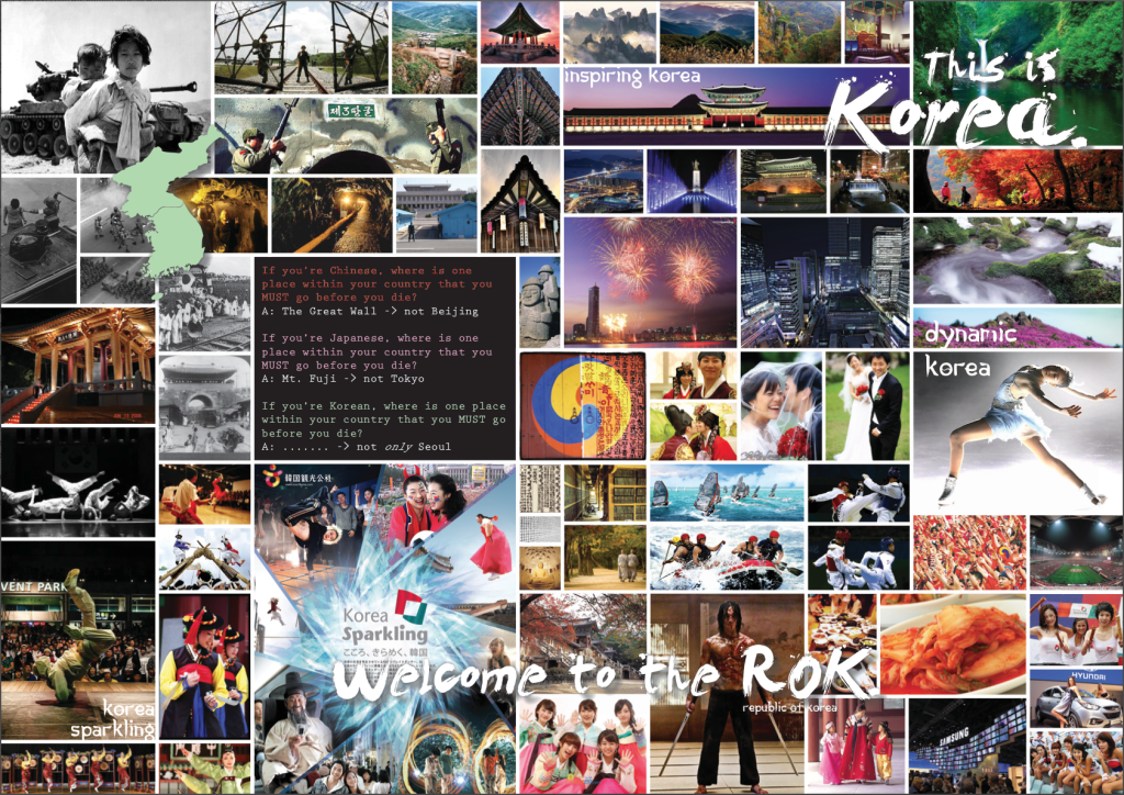
The Moodboard is a tool to help set the mood, or feeling for the direction a project is headed. In this case, for the initial moodboard, I started with three questions (see in the middle):
- If you’re Chinese, where is one place within your country that you MUST go before you die? → The Great Wall (not Beijing)
- If you’re Japanese, where is one place within your country that you MUST go before you die? → Mt. Fuji (not Tokyo)
- If you’re Korean, where is one place within your country that you MUST go before you die? → ……..? (not only Seoul)
Those three initial questions were essential to get me thinking about Korean tourism from a different perspective. Seoul is so often the focus of tourism campaigns and I wanted to think “outside the box” for this project.
Initial Moodboard
The problem is that Korean tourism focuses on Seoul so much, it often does seem to become the major focal point of a tourism campaign. But many travelers are less interested in big city life than they are in cultural and traditional assets. Tourism shouldn’t be about cities, but about culture and history.
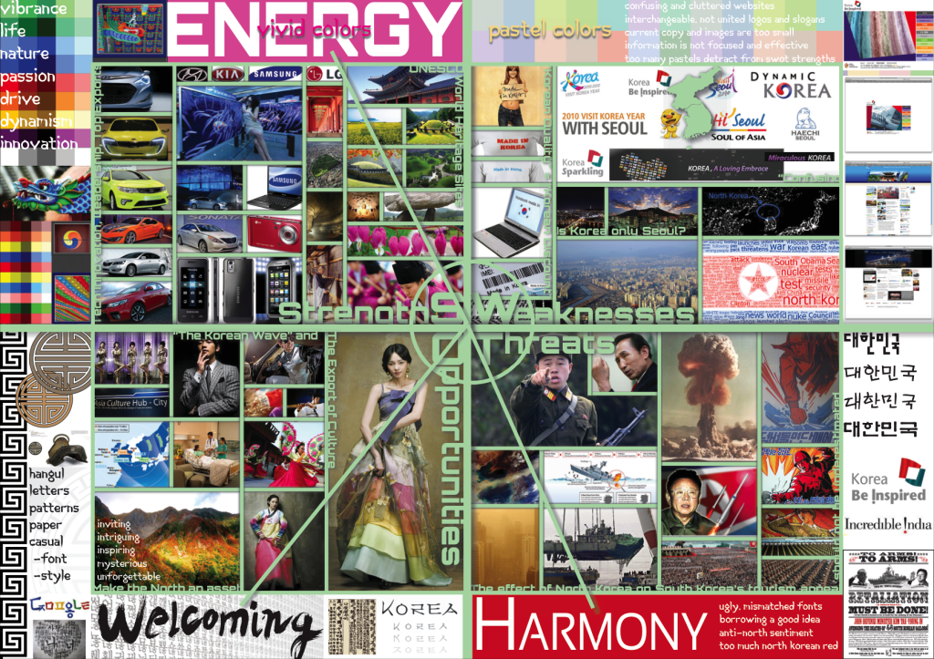
SWOT Moodboard
In this SWOT board, I was drawn to vivid colors, strong imagery, very Korean textures, patterns, and lettering, and showing a contrast between modern/technological and traditional/cultural. Weak, boring images, pastel colors, and anything related to or reminiscent of North Korea was to be avoided.
Korea needs to establish itself as unique from its neighbors, distinct, and with no immediate connection to North Korea. This will help draw in tourists to discover the Korea they don’t know.
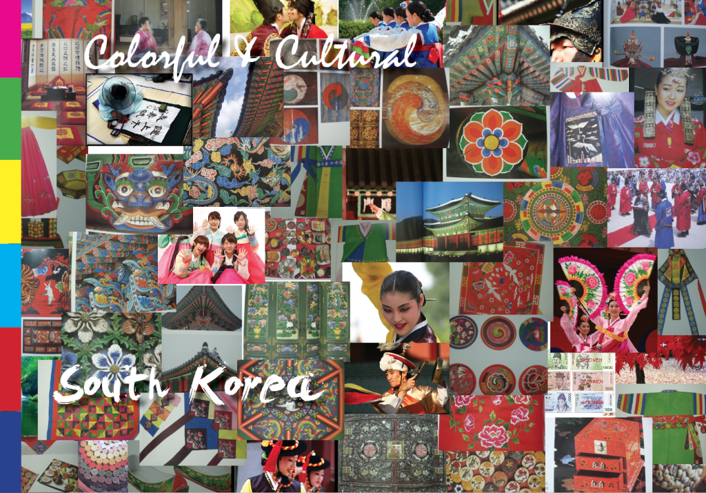
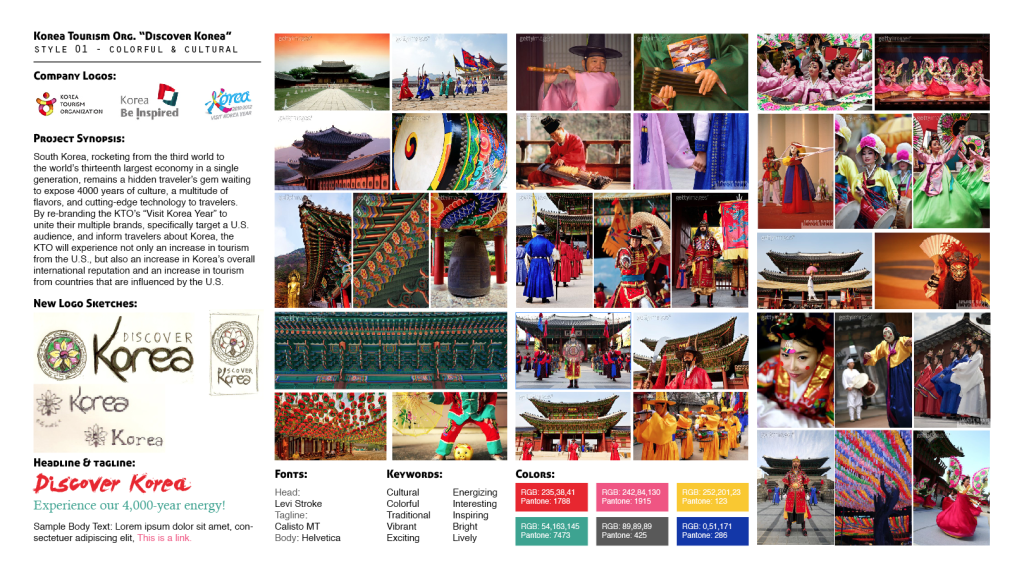
Targeted Moodboard 1 (Colorful & Cultural)
Moodboard ONE: Shows Traditional and Ancient Korea. There are many images of Korea’s historic architecture, traditional clothes, and the brilliant rainbow of colors that permeates all of Korean life.
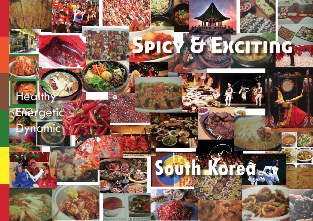
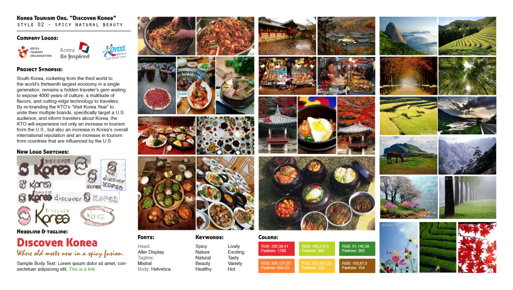
Targeted Moodboard 2 (Spicy & Exciting)
Moodboard TWO: Shows the Food and Nature of Korea. Korea is renowned all over the world for its wonderful, nutritious, and spicy food, including the dozens of side dishes present at every meal. Additionally, because Korea is 70% mountainous, it contains some of the most beautiful scenery that can be photographed.
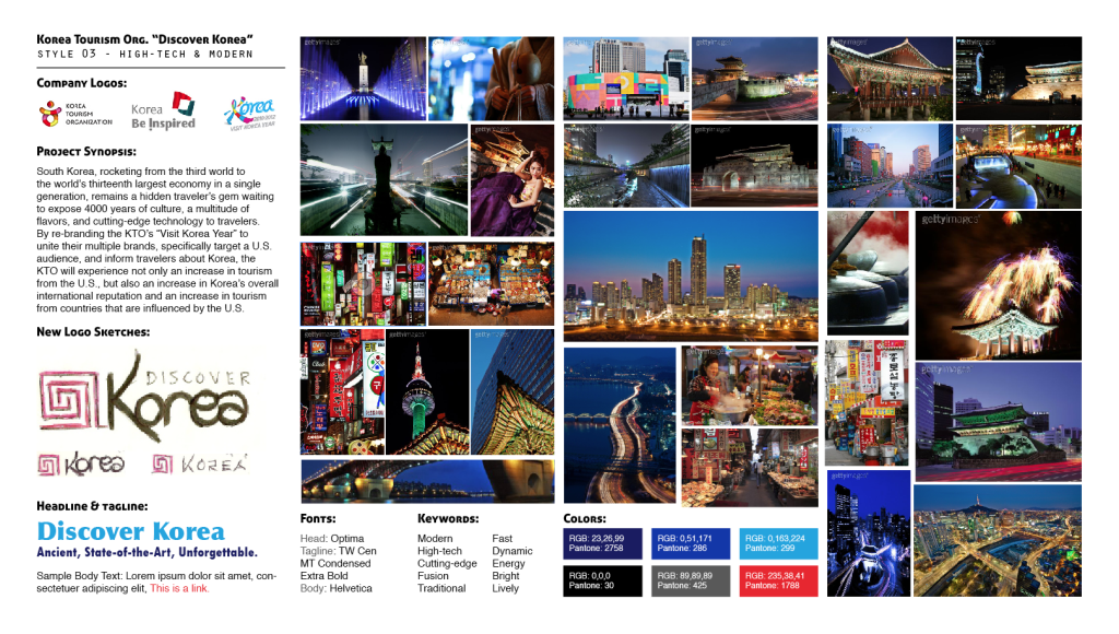
Targeted Moodboard 3 (High Tech & Modern)
Moodboard THREE: Shows the High-tech and Modern nature of Korea. Korean companies LG, Samsung, and Hyundai have become global leaders in tech development and innovation. This is something that Korea needs to take advantage of in tourism marketing, particularly because over 50% of Americans (at this time) don’t even realize that these are Korean companies.
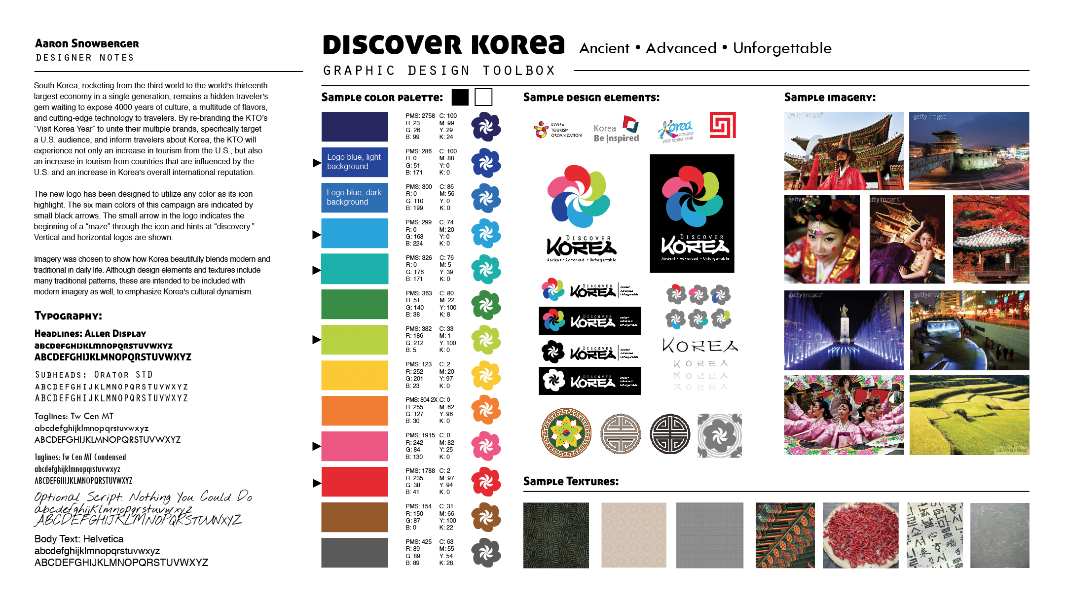
Graphic Design Toolbox
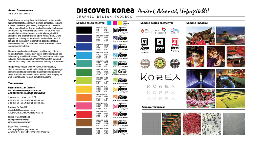
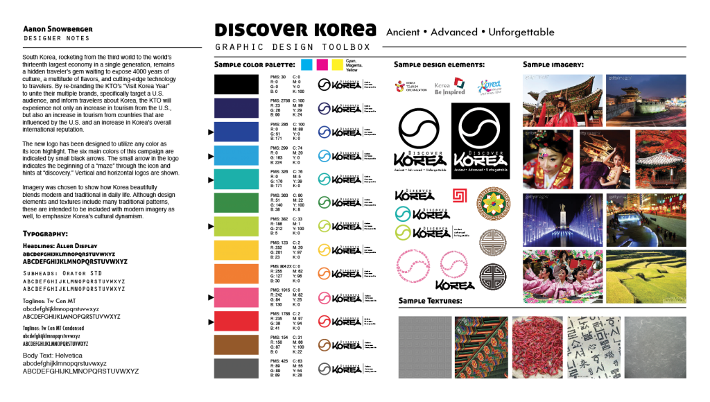
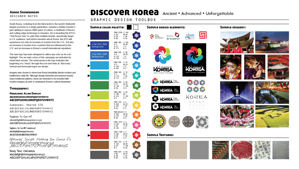
Because I combined TWO different elements on each of the preceding moodboards (and I felt I couldn’t adequately describe/brand Korea without EACH of those elements – history and culture, food and nature, high-tech and modern), I used those to help create the six-colored logo and the ultimate focus of this campaign:
Six Unforgettable Aspects of Korea
