The following is an excerpt from my 122-page Master’s Degree Design book in which I chose to rebrand Korean tourism for my year-long project. (You can download the entire e-book here, or order a hardcopy from Blurb here.)
Learn more about the Logo design and Branding here (upcoming) →
Business Cards
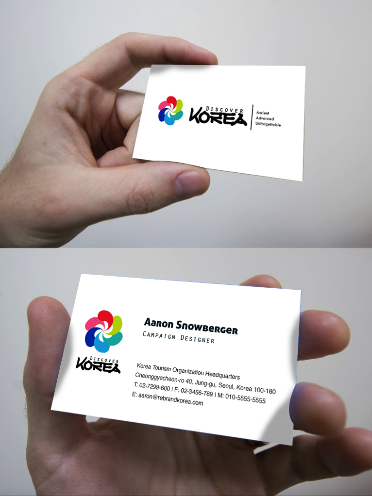
I went with a very simple and clean design for the business cards. This is something similar to what I’ve noticed with many large companies including the university I work at and Korea.net.
Official Letterhead
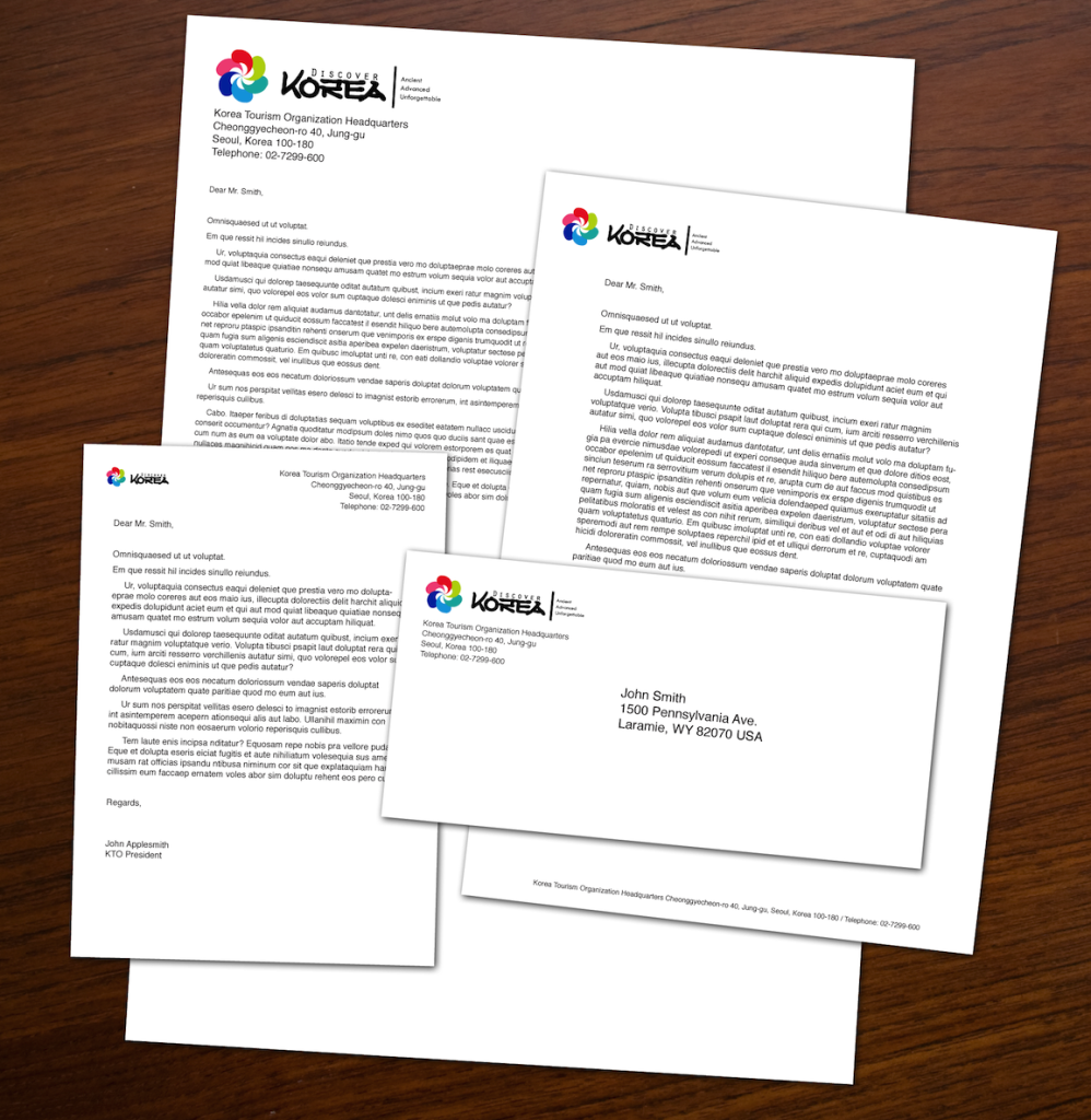
The letterhead here reflects the business card design. The documents below are A5, A4, A3, and DL (metric) sizes. The Style Guide portion of my book also goes over US paper size guidelines.
View the Discover Korea Style Guide here (upcoming) →
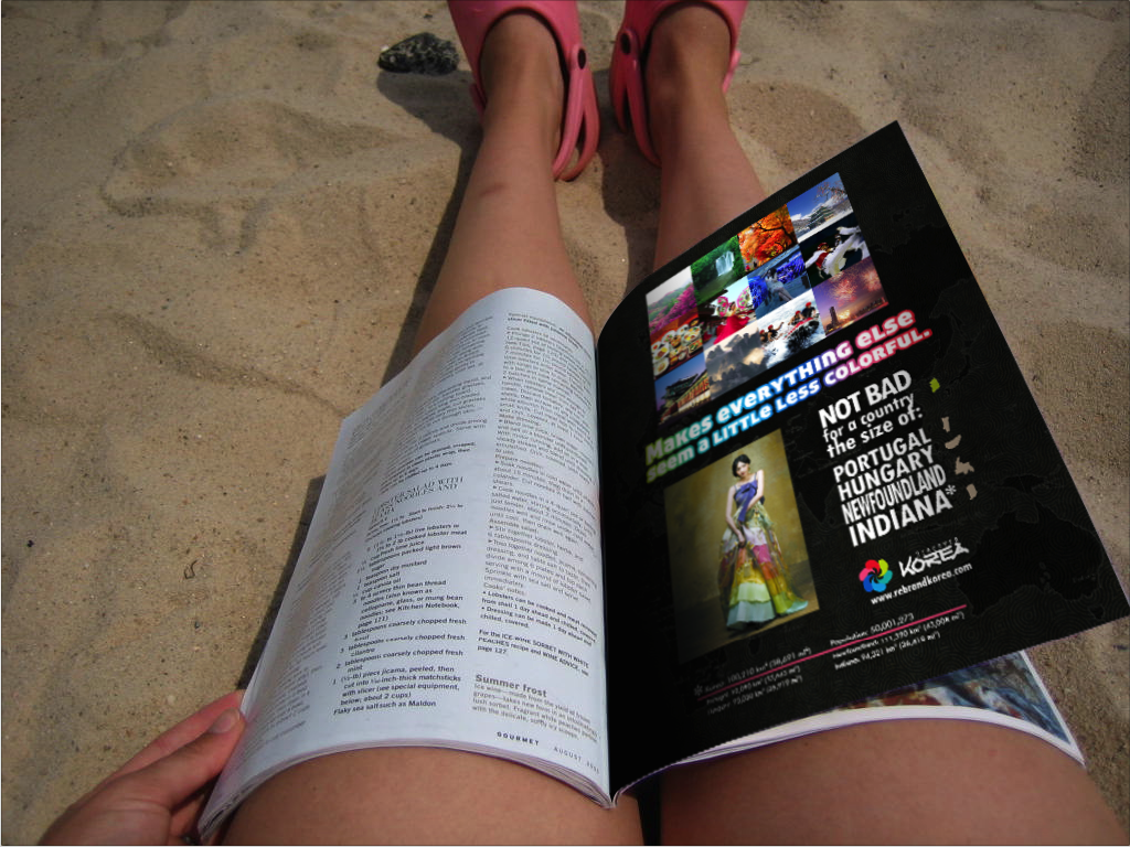
Print ads
Read more about the design process and progression of these designs here →
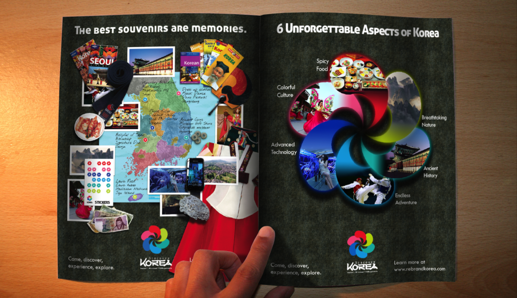
The focus [of these print advertisements] is on vivid imagery, intriguing text, and a call to action in the lower-right hand corner of the page
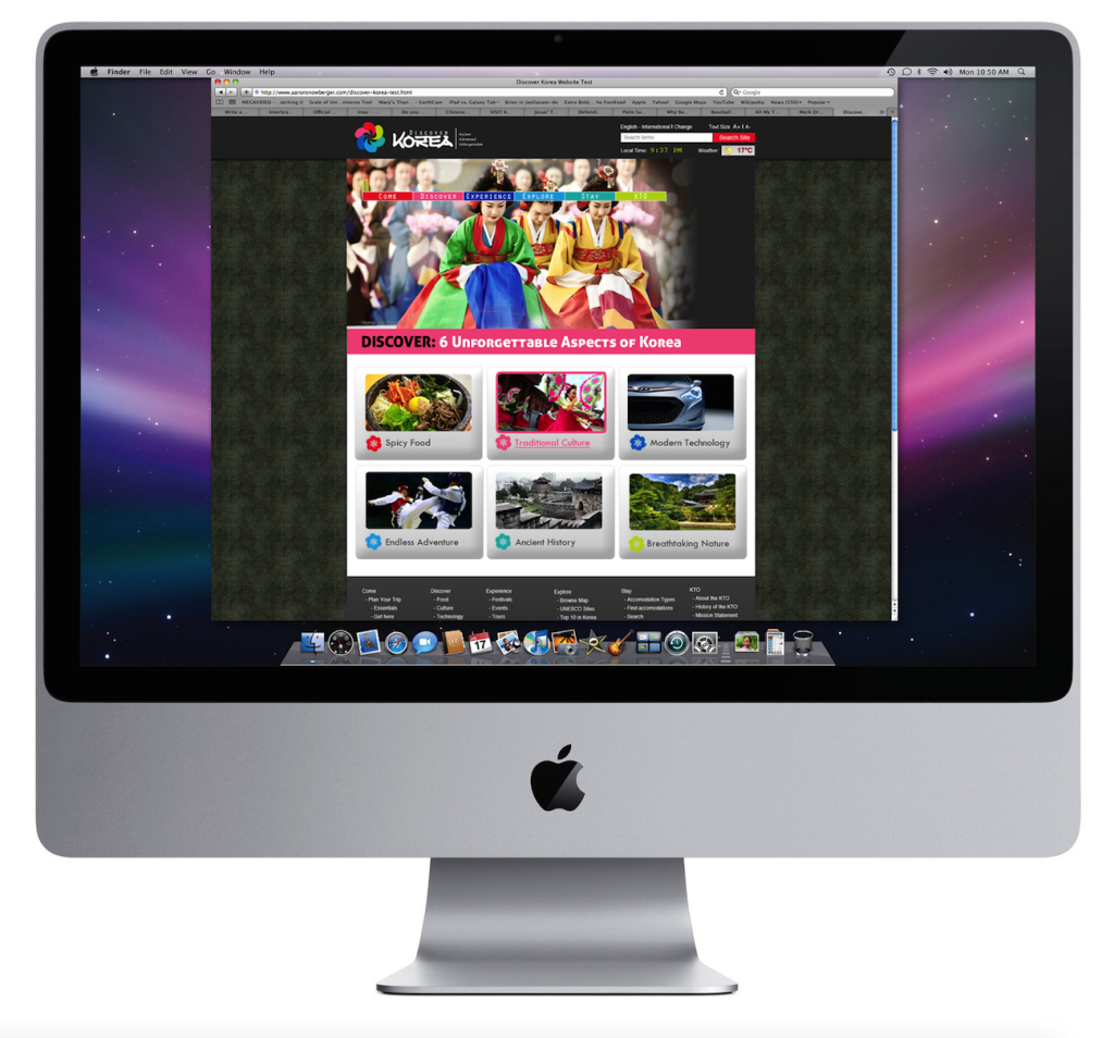
Website
Review the FULL website design including wireframes and sketches here →
The homepage includes many features that the current KTO website includes – such as events, news, advertisements, and so on. But these are contained partially down the page in order to free up the main portion of the page for what is most important: vivid tourism images.
Video
Check out the full video design process here (upcoming) →
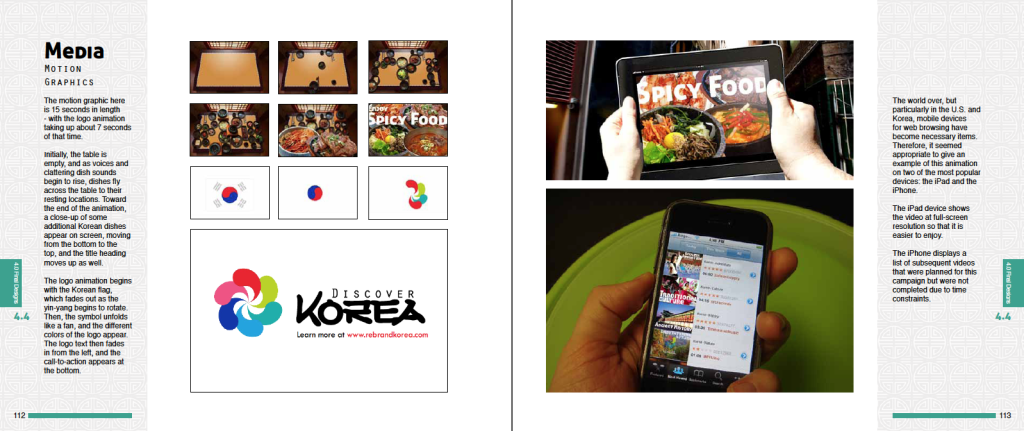
The motion graphic here is 15 seconds in length – with the logo animation taking up about 7 seconds of that time.
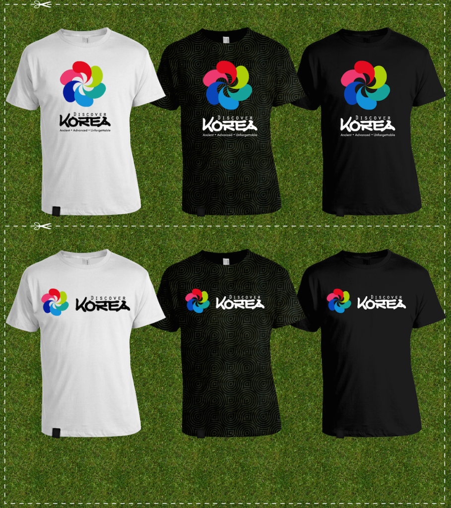
T-shirts
The patterned shirt in the center there is reflective of a similar patterned shirt that I picked up in Japan. I really liked the unique pattern and material that made the shirt and I thought it would be a unique addition to the campaign.
Hats
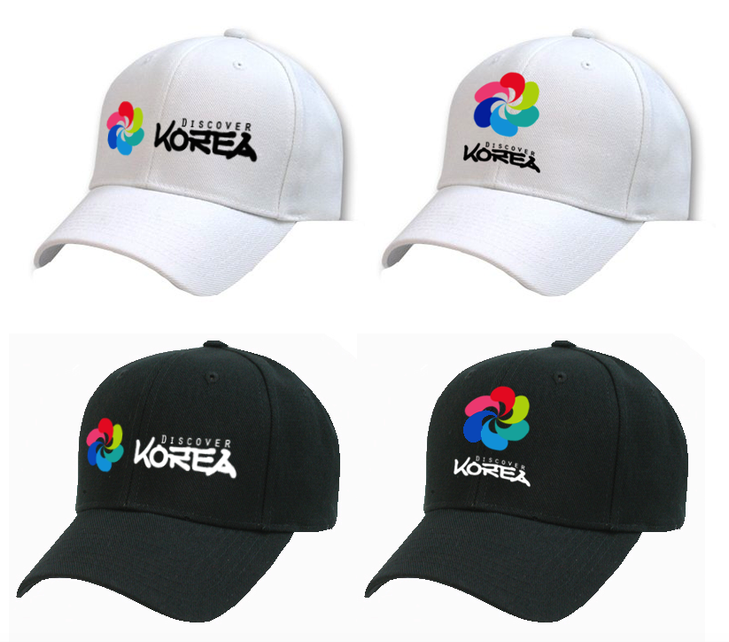
Obviously hats are a unique and fun design element and with these logo colors on black and white, the hat designs here look really good.
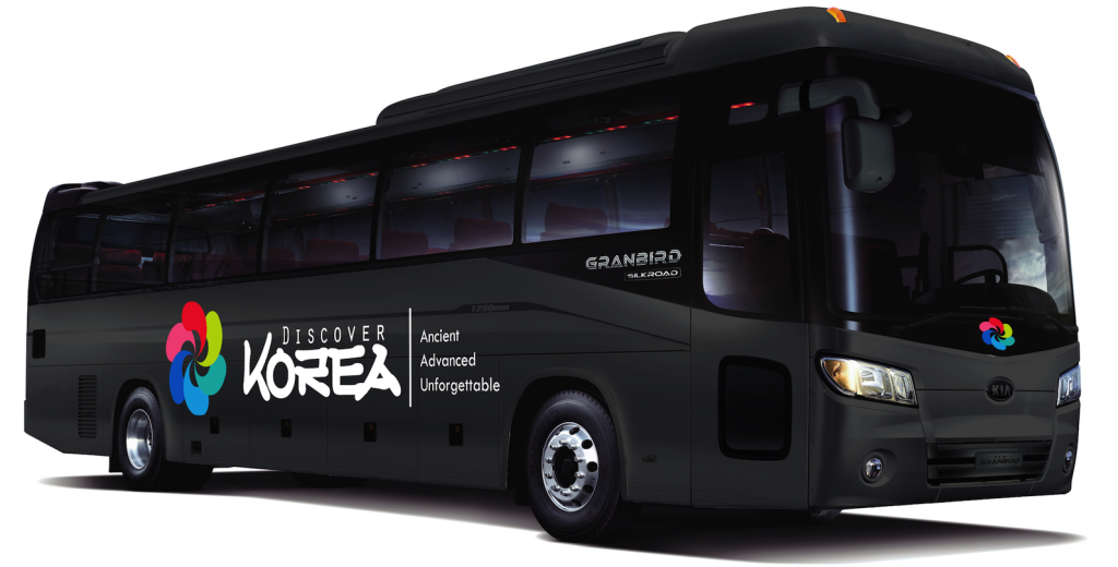
Bus Wrap
Buses are a necessity for tourism travel within a country. Buses represent the fastest and cheapest means of getting out to explore and experience everything Korea has to offer. Therefore, a fleet of tourism buses with the “Discover Korea” branding would help to spread the new brand image, and would help the KTO to maintain good visibility throughout the country in their tourism efforts.
Computer Wallpapers
I also created a number of computer wallpapers that never made it into the Campaign book.
