One of my coworkers asked if I could help “rebrand” Jeonju University’s Global Lounge (formerly the English Cafe). The previous banner had absolutely no University branding whatsoever and was just filled with what looked like a Tag Cloud of (English Cafe related) English words.
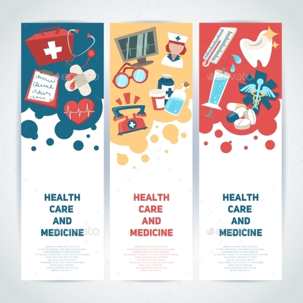
I started browsing the Internet for some inspiration and found the following image below on Envato’s Graphic River that inspired me to create the design you see above.
 I limited this design to only use the University’s own blue and yellow brand colors, a light gray, and a light brown. This kind of “limiting exercise” can often help me to think more creatively about the design and colors.
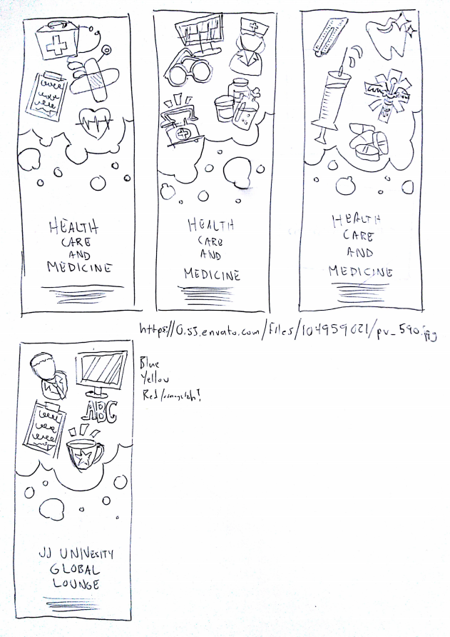
Here’s another image of the design alongside the printed banner as well as my initial sketches to brainstorm my ideas.

Click to download the (printable) PDF
- Size: 60cm x 180cm


One thought