The logo for Key To Korean combines:
- A key icon (from the Webdings font)
- A modified #2 (from a Korean script font)
- Hangul letters that could be transformed to spell “Korean” (from HY동녘M)
I wanted to create a logo that was a direct literal representation of the name “Key 2 Korean”. The #2 is positioned in such a way as to almost “point” to the circular Hangul character in the center of the logo.
In a video version of the logo:
- The key would insert itself into that circle (as directed by the arrow-like #2)
- Turn to “unlock” the rest of the logo
- The Hangul font would then rotate, adjust, and reform itself to spell (in English) the word “Korean”
This concept was taken from a previous Hangul → English design I created for my Master’s degree work at Full Sail University.
The only design specification I was given – by my wife – was to “make it green.” Her favorite color is green, so I knew she wanted the MAJORITY of the color to be green. Therefore, I started by adding a green tint to a background image I’d previously designed for a different website concept.
I decided to use the traditional Korean pattern on that background as a design element and favicon for the brand.
Logo Sketches
Although I scanned my home office for the original logo sketches, I couldn’t find them (I think they were mostly on scrap pieces of paper rather than collected in a notebook at that time in 2012). So, the sketches below show my work on the updated logo for 2015.
As you can see, I usually take extensive notes and try out as many possible ideas as I can – even some that are way outside the box. I like to try to flesh out as many ideas as possible (up to 100) with pen and paper first before hitting the computer.
Then, after sketching extensively, I take to the computer to put together my ideas in Illustrator. Below is a short sample of some of the ideas I played around with in Illustrator before finalizing the updated logo.
Here’s another logo design that didn’t make the final cut. I even tried it out on our Winter Special class ebook before deciding that it wasn’t as iconic and impactful as the original.
2012 Logo + Brand
Because we are teaching a number of different books and I’m (personally) preparing the supplementary grammar and vocab sheets for each book, I decided it would be good to keep a (fairly) unified design across all our materials and just change the color to match that of each book.
Below are a number of our header images. We’ve used these for:
- The website
- Mail Chimp
- Worksheets
- Video backgrounds
The fifth (bright green) one is the updated design color for 2015 and the final version is one of our video backgrounds from 2012.
2015 Logo & Brand

The logo I finalized for 2015 is a cleaned up version of the original logo.
- It works well in one color (whereas the other one didn’t)
- It incorporates the brand name with the icon (using the Miso font)
- And rather than keeping the old background with random simple Hangul words (like “blue” and “blog”) and a hanji paper design, I chose to use a simple one-color green and the Hunmin Jeongeum as text.
The Hunmin Jeongeum is the text written by King Sejong’s scribes to introduce Hangul as a new native Korean language script in 1446 – so it has significant meaning (and is rather cool to look at). This is the same design we used for my wife’s business cards – and the same text used in the website header.
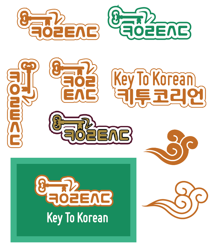
Take a look at the differences and similarities between the two logo designs below:
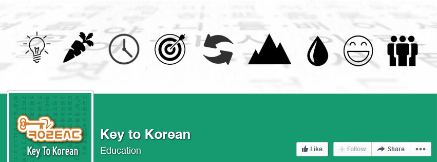
I’m also currently in the process of updating our Social Media channels with the new branding. Below you can see a working version of our upcoming Facebook cover image:
Brand Fonts
Apart from the fonts previously mentioned, the following fonts were our “brand fonts” with each design:
- Logo: Webdings, Korean script font, HY동녘M + Miso (2015)
- Website 2012: Helvetica + Helvetica Bold
- Website 2015: Roboto + Roboto Slab










Dear sir
I am Sanjay Sachdeva from India.
I like your new design which is written Korea .
Can you please send the name of this font .
Thanks
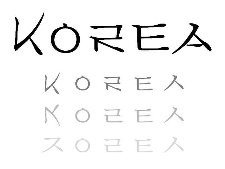
The original font is just a Myeongjo font – probably Apple Myeongjo since I designed it on a Mac. But I manipulated the font and changed the letter forms and shapes a bit to create the “Korea” design. So, it’s no longer a part of any font – just a modified group of letters from Apple Myeongjo.
Hi Aaron,
Absolutely LOVE the Korea font you created. Is it available for download or purchase anywhere?
Best,
Dan
It isn’t available yet, although I hope to be able to work on it some more in the coming months. I’ll post here if/when it’s available. Thanks for your interest!