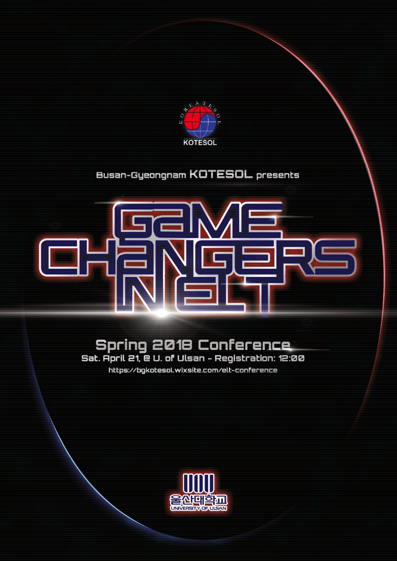
Toward the beginning of 2018, the President of the KOTESOL Busan chapter contacted me to work on designing a poster for their Regional Conference.
In November 2017, I’d just finished listening to Ernest Kline’s bestseller, Ready Player One, that was being made into a movie due to come in the first quarter of 2018. I had been really enthralled with the book and loved the marketing – particularly the new logo – for the movie. So when Rhea told me the name of the Conference would be “Game Changers in ELT” I knew I wanted to do something along the same lines as the movie poster.
Logo Design
The font I used is literally called “Ready Player One.”
Poster Inspiration
- I started researching the location because I’d never been to, nor seen the campus before. It turns out one of the buildings is quite famous and easily distinguishable. I thought I might use that in the poster design – I even made a line drawing of it.
- And because the logo was a bit “techie” or “video gamey” I thought it might be cool to incorporate some Tron style background effects into the poster. I did some looking and found a nice tutorial on Abduzeedo.com that showed how to do some of those kinds of effects.
- I also found some really unique designs on the 2017 SyntaxCon website and considered how I might use a similar effect in this design.
First designs
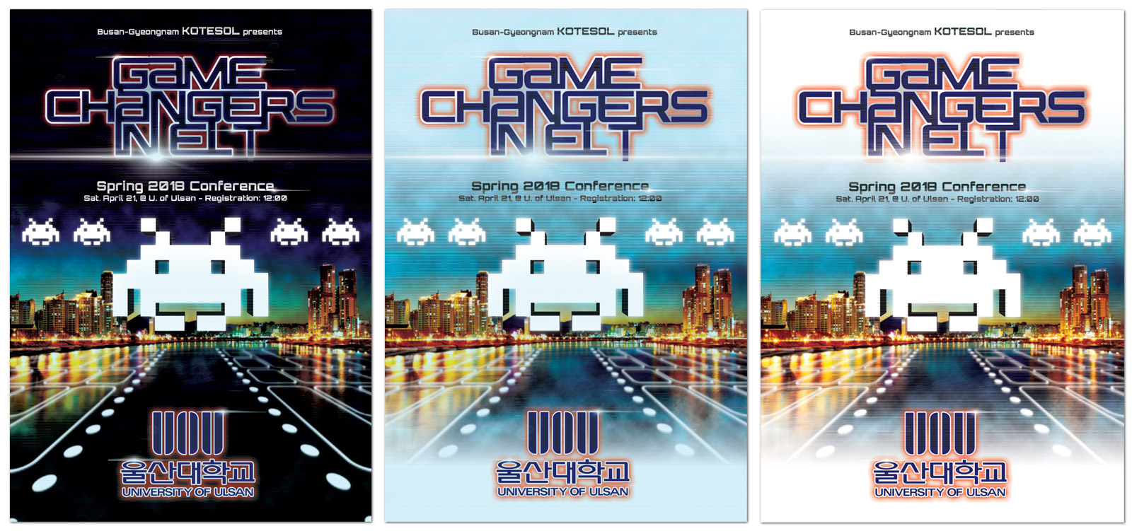
After some playing around with the Ulsan university building – especially in the line drawing format, I decided that it would be too “dull” as blue glowing outlines. There wouldn’t be enough real “substance” – it would feel just like a glowing line drawing and not a true location. So, I started playing around with some more backgrounds and found a cityscape at night that looked really nice. But I thought I might still need something else to help complete the poster, so I tried two ideas:
- I used a 3D Space Invaders creature in the center – as if it were approaching and “attacking” (seen above) – but ultimately we decided that, though cool, it wasn’t really appropriate for the tone and message the chapter wanted to convey for the conference.
- The other idea was to have a hand at the bottom of the poster holding a notebook of some kind with a map or list. But ultimately, we decided again that this would overcomplicate the design – so we decided to just remove everything else and focus entirely on the logo.
Final designs
After removing all the excess, the poster still felt a bit empty, so I added a glowing oval around it like the original Ready Player One’s glowing easter egg. This was also a nice reflection of the KOTESOL logo which makes use of the red-blue yin-yang of the Korean flag. I created a black and a white version. The final versions removed the “video game” style overlay of horizontal lines.
Rhea then also put together a Conference website that included the design.


