Design Brief
From the Style Guide:
A multi-church worship night was proposed in Jeonju to:
- promote unity among the English worship services
- get to know the other churches
- make connections with other non-Koreans
- reach out collectively to both the expat and Korean communities in Jeonju and Korea
We hope this will be the first step down a long, fruitful road together.
As with all churches – and organizations – each body has its own unique identity, goals, visions, members, passions, missions, and purposes. The goal herein is to create a unified vision, brand, and identity for the collective association of Jeonju English fellowships, while respecting and maintaining each one’s inherent personality.
In addition to this, it remains imperative to keep Jesus at the center of it all. He is “the author and perfector of our faith” (Hebrews 12:2), the head of the global Christian church (Colossians 1:18), and the unifying agent of all Creation (Colossians 1:17). Therefore, it is important to keep a clear representation of Jesus within the brand as well.
Furthermore, it must be clear that Jesus, and no one else, is the object of our affections. We are not an inter-faith association, nor do we intend to become one. The word “God” can sometimes be ambiguous enough for others to insert their own definitions into, but “Jesus” is clearly the Christian God.
Neither was this association initiated to boost in pride or glorify any particular fellowship. Jesus alone is to be glorified, and must therefore remain at the center of it all.
3 Keys Elements for Design:
- Promoting Unity
- Reaching out
- Jesus at the center
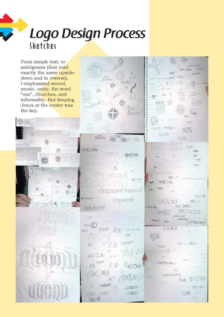
The Logo Design Process
Sketches
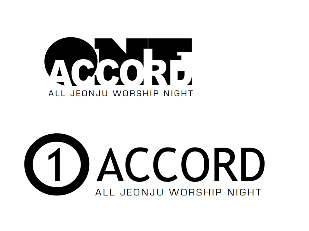
Initial Digital Concepts
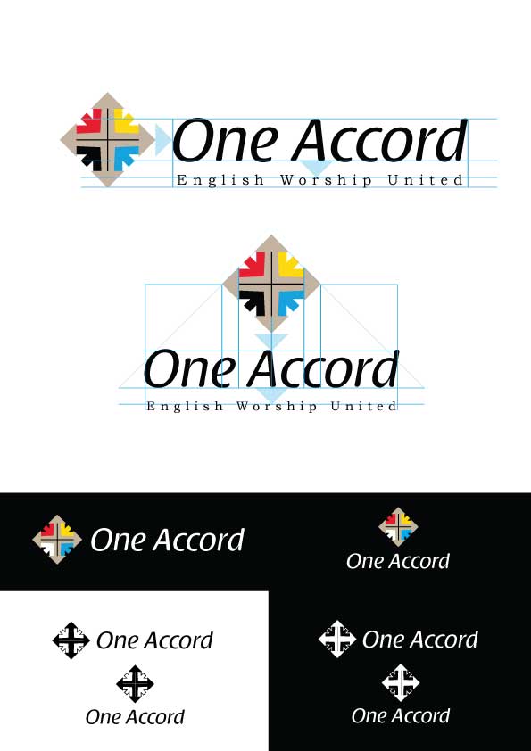
Final Designs
Explanation of the Logo Symbol
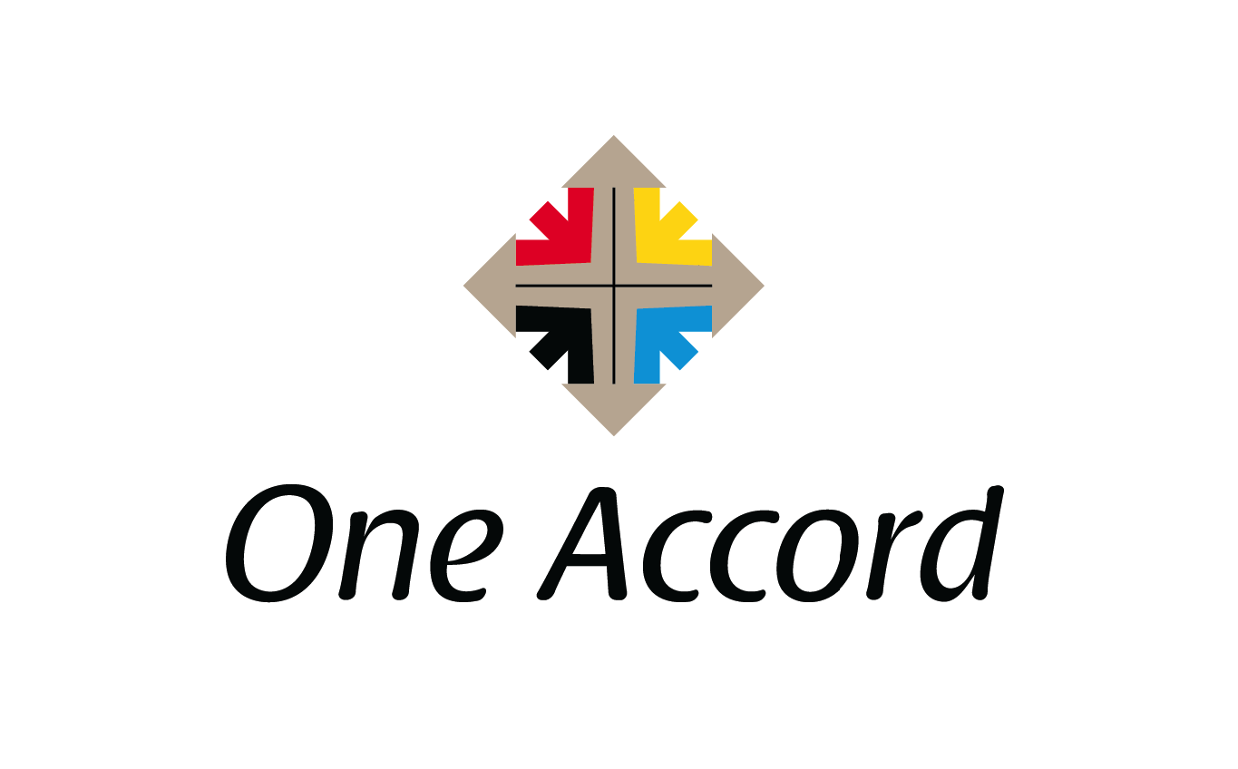
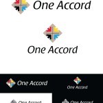
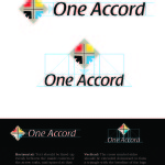
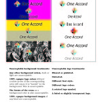
At the center is an image of the cross – representing Jesus, the center of our faith.
Surrounding the cross image are four colored arrows that encircle and gather around the cross. This represents the way in which, with Jesus at the center, we find unity despite diversity: churches unite under a common banner, Jesus.
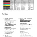
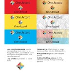
The four distinct colors of arrows were originally based upon the old hymn “Jesus Loves the Little Children” but “white” was changed to blue to better complement the other colors and enable better visability against a variety of backgrounds. The different colors also represent the diversity among the different churches that unite under Christ.
Additionally, the four colors can represent four distinct people groups the One Accord members seek to reach out to: expat English teachers, international students, immigrants, and native Koreans. Furthermore, the three primary colors (red, yellow, and blue) and black are the base colors for the creation of all other colors and as such represent all peoples of the world united in Christ and under Christ, as part of the global Christian church.
But unity is not all the church is called to, so the ends of the cross extend to arrows that point outward. This represents the church’s outward expression of worship, as well as the missional orientation of the church as it reaches out to the lost.
Style Guide
Click here to view the complete Style Guide, or click below for a sample.
