I created the TCC church bulletin design in April 2010 and continued creating and modifying each weekly bulletin until August 2011. So for about 1.5 years, I was doing both the TCC bulletin design AND the AICF bulletin design – while going to grad school.
It only cost me about 1 hour per week when there were no modifications to make, but when major revisions were requested, I could be at it for up to 5-6 hours per week. Additionally, since each weekly bulletin consisted of up to 12 pages, it was like creating a weekly mini-publication. I was seriously impressed with how much content the pastor cranked out every week. He’s definitely a researcher, scholar, and writer. He could easily have published a book with the materials he sent me.
Design Inspiration
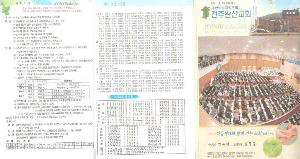
I was initially given a handful of sample Korean church bulletins the pastor liked for inspiration for design like the one seen below:

Bulletin Design Notes
Korean church bulletins are interesting in that they try to cram a TON of text and information onto their bulletins by minimizing the whitespace and reducing line spacing in order to maximize the size of the text. In my opinion, this kind of “bigger text” actually REDUCES readability.
In good design, more words on a page requires a smaller font size with a greater line spacing. This significantly increases readability by increasing whitespace and reducing the proximity of words that may cause them to visually blend into one another. In my bulletin designs, I did my best to increase the whitespace as much as possible in order to aid readability and be able to more neatly cram large amounts of text onto a page. This included breaking the text into columns like newspapers do.
I also designed the bulletin to incorporate the green, blue, and orange of the logo. Each color had significance in the bulletin design:
- Blue: professional, cool, youthful – was used for the front and back cover, the Youth ministry page
- Green: growth – was used for the sermon message
- Orange: family – was used for the family ministry area and weekly devotional sections
Finally, the bulletin was created to be printed front-to-back on multiple A4 pages, then folded in half and stapled along the center. Thus, in the designs below, you can see pages 1 and 8, for example, on the same design paper.
2010 Version 1
2010 Version 2
Design changes:
- Church info (in blue) vertical on the left rather than horizontal on the top
- Added space for “Holy Community” and reduced space for sermon notes
2010 Version 3
Design changes:
- Expanded “Holy Community” section
- Redesigned back cover for prettier Announcements
Bulletin Design Notes 2
I personally like to change up a “regular design” like a weekly bulletin every New Year. It helps to bring some new inspiration, vision, and emotion into the New Year and is a time when everyone feels ready for a change anyway. (Check out the yearly progression of the AICF church bulletin here.)
To that end, toward the end of 2010, the pastor’s son redesigned the original bulletin in Adobe Illustrator, then passed it on to me as inspiration for 2011 and to clean up and recreate in Adobe InDesign. You can see his design below:
2011 Version 1
Design changes:
- 12-pages (3 front-to-back A4s) rather than 8 (2 front-to-back A4s)
- Compartmentalized church info on the front
- Moved Service Order to the front cover
- Redesigned (expanded) weekly Devotional section (3 pages rather than 2)
- Added section for “Youth Together”
- Added some unique images and title treatments
2011 Version 2
Design changes:
- Added a Family Devotional section
- Lightened (and put in a single color) the church info compartments on the front
Longer Service Order for Baptism Edition
2011 Version 3
Design changes:
- Removed “Youth Together” section (they started making their own)
- Redesigned the back cover
Bulletin Design Notes 3
Around August 2011, keeping up with the church bulletin designing every week was becoming more burdensome for both me and the church. My son had just been born about 7 months previously and my wife was going through some very difficult postpartum thyroidosis. And the bulletin design timeline looked a little like this:
- Me: Wait for the full text of the next week’s bulletin, sometimes up to Saturday night
- Church: Wait for the completed design PDF for printing, sometimes up to Sunday morning
Therefore, in August, I was relieved of my duties to prepare the design every week and I turned over the responsibilities to one of the church deacons.
But toward the end of 2011, they asked me to update the design again for 2012 in InDesign (since I was trained in its use and the deacon mostly updated and modified what I’d previously created). I agreed to, but shortly afterward my wife and I decided to stop attending TWO churches every Sunday and focus on just one. Nevertheless, the design below was my design for 2012.
2012 Version
Design changes:
- Redid the front cover to simplify church info and add the weekly essay
- Added an “ABCs of Salvation” portion inside that the pastor liked in the AICF Bulletin design
- Moved the Service Order inside and redesigned it a bit


