Initial Concept
Shortly after Sujeong Church decided to not use the Bended Knees United brand and business cards, the pastor contacted me with a new idea for JHOP: Jeonju House of Prayer.
The Scripture: Isaiah 56:7 – “These I will bring to my holy mountain and give them joy in my house of prayer. Their burnt offerings and sacrifices will be accepted on my altar; for my house will be called a house of prayer for all nations.”
Here are some ideas: I like the 2nd picture mixed with the 4th picture being used as a flame, with a modern clean globe in the middle with Jeonju House of Prayer. So let me know your thoughts.
Design Brief
I was quite busy at the time, so he took a while to step back and solidify his idea.
Aaron I have a concept and design finally that I would like you to help with for the logo for the House Of Prayer. My friend sent me some graphics he worked on and I want to collaborate with what he’s given me.
Description:
- I would like to have the Hand of of God holding the house of Prayer in the middle. I have a picture of an example I want. The hand is positioned exactly how I would like it in the example.
- I would like to have the House of Prayer inside the hand. Signifying the House Of Prayer is being held only by the Grace of God which is God’s hand.
- Inside the House of Prayer I would like the name or concept my friend worked on for me.
- And for the colors I would like Black/white/orange.
Tell me your thoughts or if this is possible.
Design Requirements
- Hand of God holding the
- House of Prayer
- JHOP: Jeonju House of Prayer
- Colors: Black / white / orange
Initial Samples
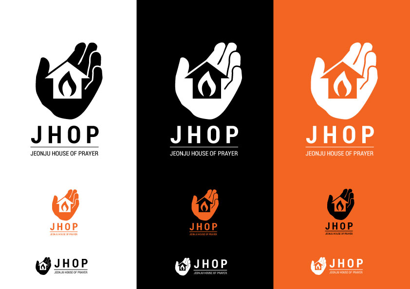
Concept 1
Reply:
Here you go. Is this what you were looking for? I was going to caution against black-white-orange as a color scheme because with the wrong shade of orange, it might look slightly Halloween-y. But with the more red-orange shade you selected in the wrists picture, and as long as you don’t use all three – orange, white, and black – together at the same time, I think it’s a good choice.
I understand the orange is for fire, right?
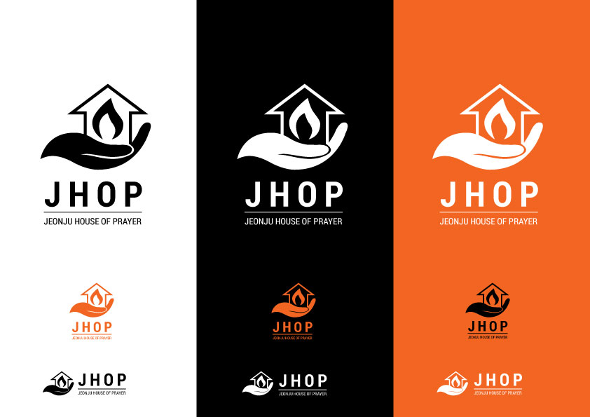
Concept 2
Reply:
Second concept. I used a more simplified hand similar to one I found online: http://thenounproject.com/term/hand/44711/#
Makes the hand look a little bit like a dove (Holy Spirit) – thought you might like it. And I think it’s better than having a cut-off square wrist.
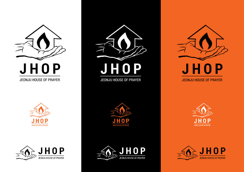
Concept 3
Final Designs
For the final designs that were actually printed, we:
- Added a box around the logo
- Highlighted the flame in orange to make it stand out
- Added a tagline: Prayer | Missions | Justice
All in all, we both agreed that this is a pretty striking design.
Samples of the logo in use are pictured below:


