Date & Venue:
Saturday, April 21, 2012
GeunYoung Girl’s High School, Jeonju, Korea
Background:
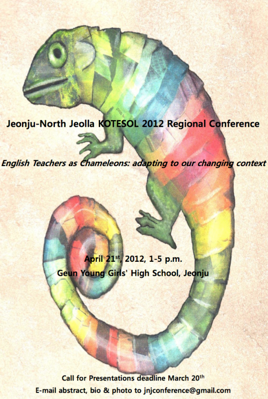
Allison, one of the organizing members of the conference and the usual poster creator appreciated my work on the first One Accord posters and asked me to do this poster for them. Below is her initial mockup design for inspiration.
Design Deliverables
For this design, I modified the initial poster design for a few purposes.
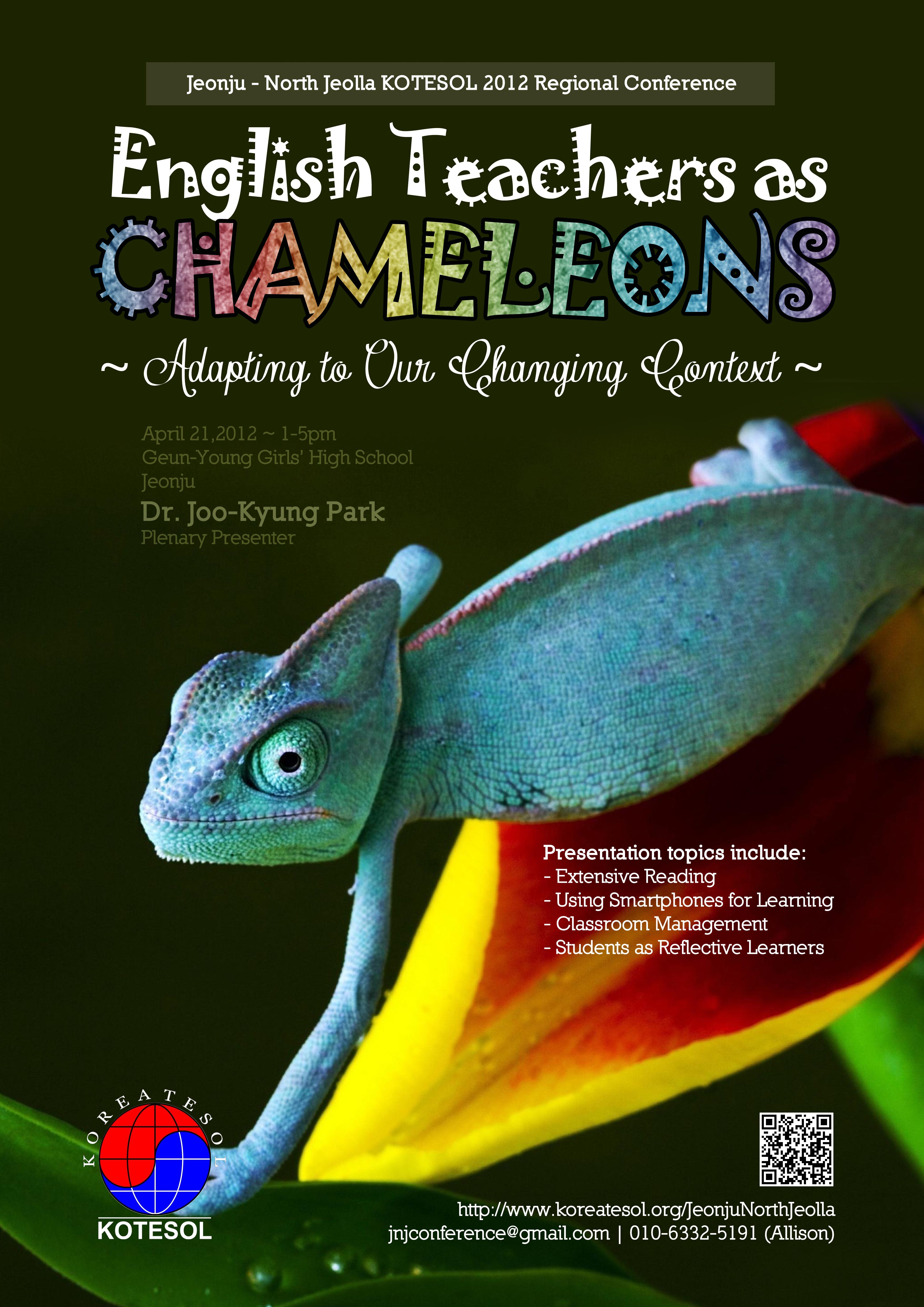
- A2 Poster (pictured above)
- A4-size front & back (with map) designs for the conference book
- 1/4 A-4-size Postcards for handout (with map on the back)
- A PPT Template (including Title slides)
The PPT template was my own idea and not a “commissioned” work per se. I just thought it would be a cool idea to have a template for the presentations that matched the poster and book design. The template was not distributed to anyone else except me.
A4 Conference book
Postcard designs
PPT Template


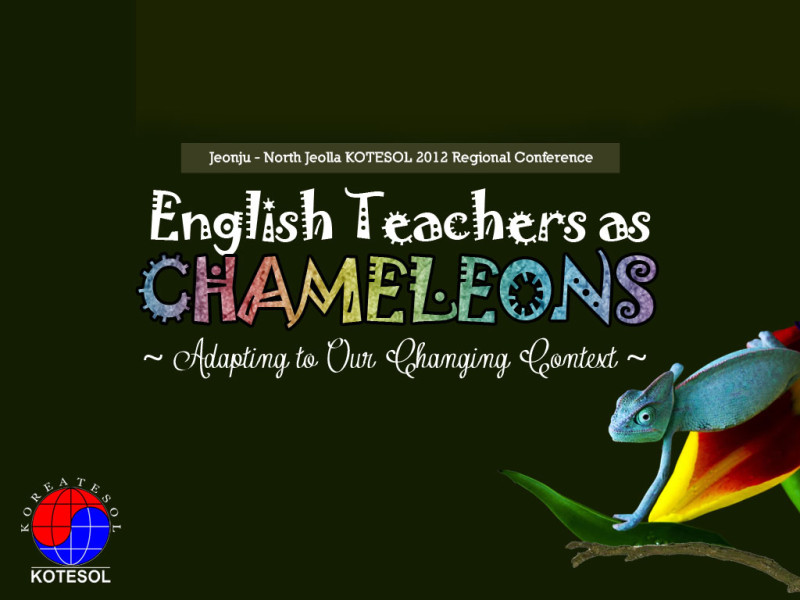
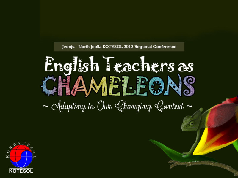
For the PPT design, I thought it would be interesting to have two Title Slides that showed the chameleon blending into the flower in the background. You can see how this worked in my own PPT presentation for the conference embedded below.
Fonts Used
- Chameleon Title: Jokerman
(never thought I’d use this font in anything – but here it is and looks good too) - Subtitle: Contribute_FREE version
- Body: Nilland


