Date & Venue:
Saturday, Sunday, October 20-21, 2012
Sookmyung Women’s University, Seoul, Korea
Background:
After seeing my work on the Jeonju-North Jeolla KOTESOL 2012 Regional Conference Poster, Phil Owen, the 2012 Conference Chair, asked me to consider doing the poster design for the 20th Annual International Conference. “I’d love to,” I said.
Design Brief:
All the ideas for this design came in the form of email correspondence and there was no “official” design brief. However, I’ve done my best to collect the main points of our emails and focus them into an “unofficial” brief:
Target Audience: English teachers in Korea – hagwon, university, public/private school, younger, older, Korean, western, school principals, owners, textbook publishers, distributers, etc
Conference Keywords: Perfect Score, 100%, community, methodology, community, practice
Idea Keywords: Penrose triangle, triangle, sam-taeguk, Korean dragon, year of the dragon, score, 100%, splatter tae-guk, 20th, anniversary, interconnectedness
Feelings to evoke in the audience: professional (#1), fun, interesting, educational, powerful, moving, innovative, informative, challenging, NOT immature, NOT youthful, bold?, simple?, complex?, purposeful (if I put too much imagery, or unrelated imagery, the purpose won’t be clear)
Initial Ideas:
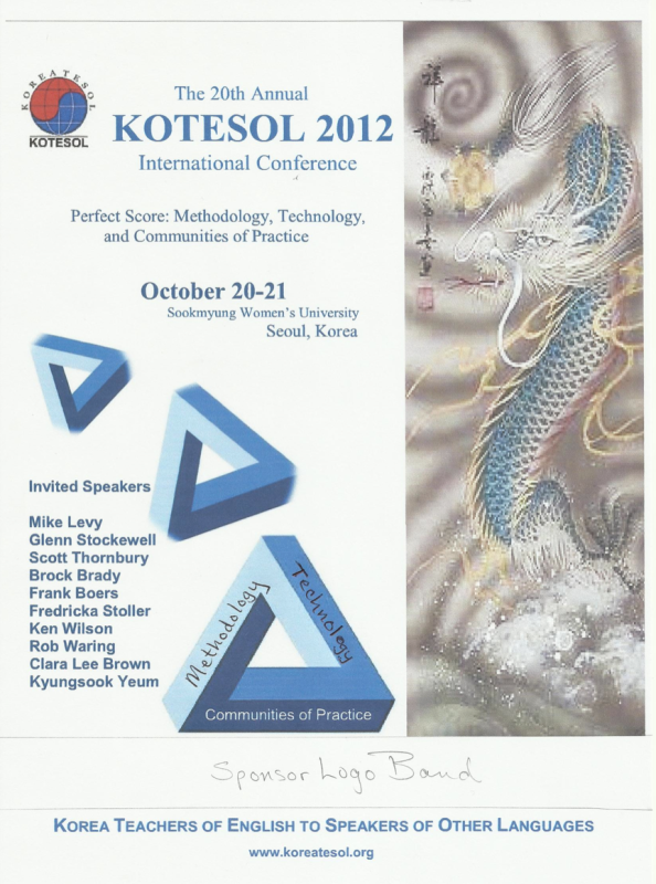
The first concept given to me was by Dave Shaffer, the Publications Committee Chair.
The penrose triangle does kind of get at the idea I was trying to get at — reminds me of an Eischer exhibit I once saw. [Methodologies, Technologies, and Communities of Practice – the Conference Title – are three sides of teaching that are necessary and interact with one another.
The dragon image was included because 2012 was the Year of the Dragon.
Previous Conference Posters:
For inspiration, I was encouraged to take a look at previous Conference posters. As you can see, most of them follow a very similar design pattern. So, I wanted to create something totally unique.
Round 1
| Concept 1 | Concept 2 | Concept 3 |
| Uses a Penrose-inspired font called FRUSTRO. | Focuses on the “Perfect Score” of 100 points. | Incorporates the Penrose triangle and a Korean pattern. |
Round 2
I was told the focus of the poster should be on “The 20th Annual KOTESOL International Conference” and not so much on the theme itself. So I redesigned the Conference Title.
We also agreed that a traditional Korean wall from Jeonju’s Hanok Village (English) would be a good image to include – keeping things visually interesting and simple enough to add tons of text to.
Final Design
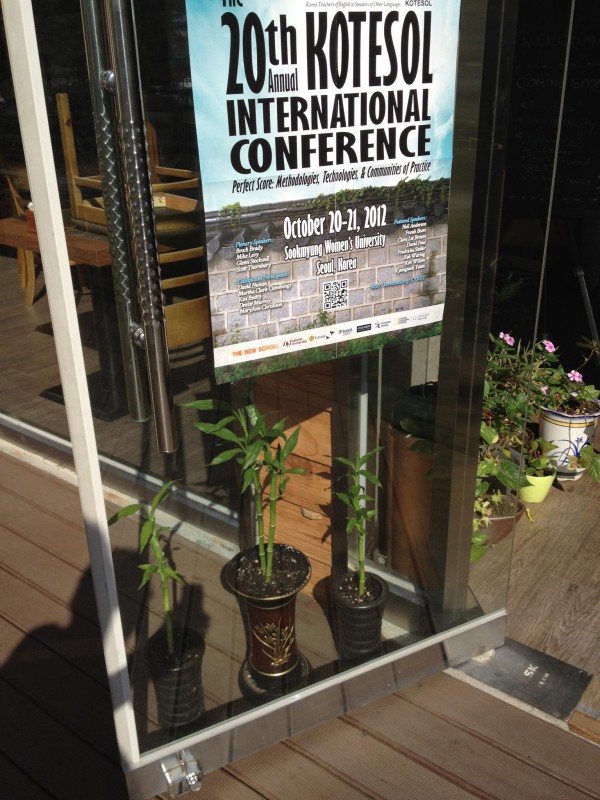
Here is the final design in printed form.

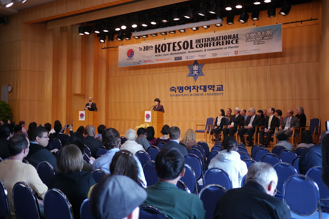
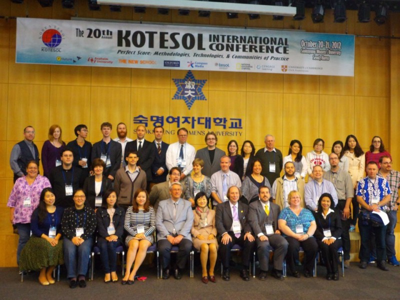
Note: I didn’t design the banner, but included it to show how my design was used by the printing company in Seoul that printed all the materials.


