Aaron

Graphic Design Portfolio

I started working with David Van Minnen on The Jeonju Hub back in 2008 after I sent him a favicon for the site and suggested he use it to add a bit more style and professionalism to the site. Since then, I’ve worked with him on numerous other projects that include:

  1. The Jeonju Hub
    1. Website (Joomla!, then WordPress)
    2. (Updated) logo
    3. Business cards
  2. Jeonju Diner
    1. Website (WordPress)
    2. Logo
    3. Business cards
  3. Jeonju Jobs
    1. Website (concepts)
    2. Logo
    3. Business cards
  4. Paul Church
    1. Website (static HTML & CSS)

JeonjuDiner.com

Visit JeonjuDiner.com →

After creating the Jeonju Diner business cards, I was also asked to create a website to house their menu, some images of the food, and a map to the location.

The following image was given to me as a basic guide/template/moodboard to use as inspiration to create the website:

Jeonju Diner inspirationI installed WordPress, found an appropriate theme (Adapt by WPExplorer), and built the site with that.

The Jeonju Hub, Jeonju Diner, Jeonju Jobs Business Cards

In 2011, the owner of The Jeonju Hub was just getting started working on a new venture, the Jeonju Diner, and asked for three business card designs that included his recruiting business (Jeonju Jobs).

He wanted them simple and clean, and I wanted them to all “match” so I took the same colors and font from the original Jeonju Hub logo and added a different colored strip to each card:

  • Green: for the Diner, symbolizing “food”
  • Blue: for the Jobs, symbolizing “professionalism”
  • Orange: for the Hub, symbolizing “energy”

Each card was just one-sided save the Diner card which included a map on the back. See each design individually below:

PaulChurch.com?

Visit PaulChurch’s archived site →

In 2009, after successfully transferring TheJeonjuHub.com from a static HTML site to Joomla! the site owner commissioned me to create a new website for the English church he was a leader of. He gave me some images, all the content, and a short design brief and I got to work coming up with the designs you can see below (or interact with if you click the link above).

This site began with me drawing up a flat image wallpaper of the church building in Photoshop because I liked the shape of the building so much. This became the “logo” for the site:
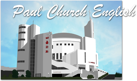
paullogo

Ultimately, this site never went live (thus the question mark in the title) because one of the Korean church leaders from the main church (that the English fellowship was a small part of) returned from abroad and decided to stick with their old site that they’d been using previously.

TheJeonjuHub.com

Visit theJeonjuHub.com → Visit the Web Archive from: 2010 → 2011 → 2012 → 2013 → 2014 → Years ago, TheJeonjuHub.com once was THE place to go for any expat looking for any info about Jeonju. It was: An English news site City Guide Event Calendar Job seeking/recruiting site With “For Sale” and “Want to Buy” ads …