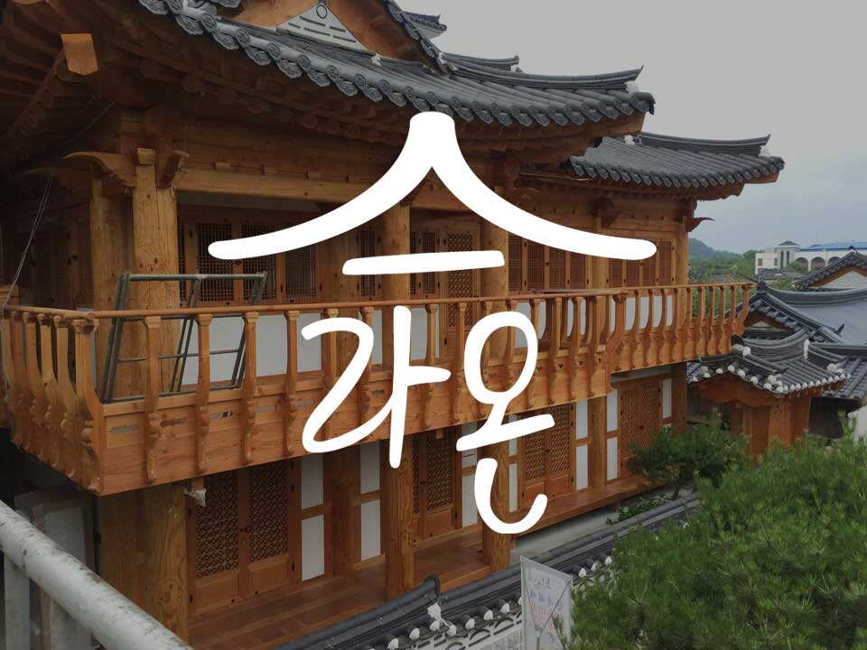
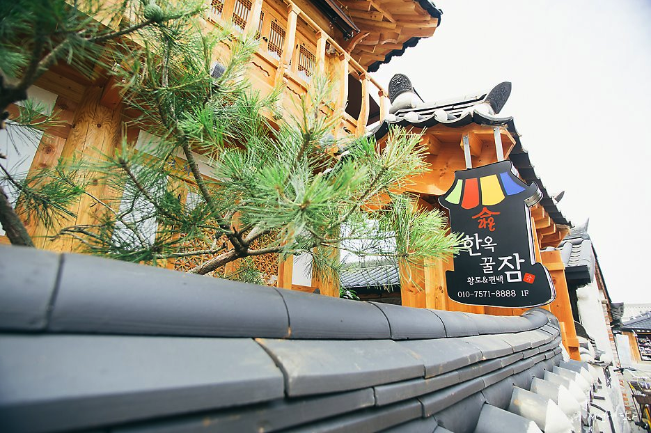
I was recently presented with a great opportunity to design a logo for a new Hanok (traditional Korean style house) cafe and guest house. This project definitely has the highest potential visibility of anything I’ve ever done.
Jeonju Hanok Village annually attracts upwards of 8 million visitors and that number is expected to top 10 million in the next few years! So needless to say, I jumped at the opportunity to make my own contribution to the growth of Jeonju’s Hanok Village.
Project Brief
- Project: Logo design for Hanok coffee shop (2nd floor) + guest house (1st floor)
- Name: ‘Laon’ (라온) means “happy” or “enjoy” in pure Korean (즐거움)
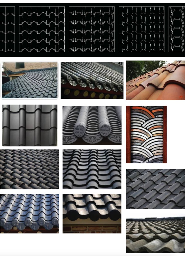
- Image: Focus on the roof of the building (actually the tiles called Giwa (기와))
- Font style: something light, handwritten, & modern, appealing to the target audience
- Target audience: young people in their 20s and 30s (this is the current majority demographic of tourists to Hanok Village – they tend to travel more, want to explore and have adventures, and spend more money)
The following are the first images I was sent to help with the design process.
The four images at the end give an idea of the types of fonts she wanted to use both in the logo and the menu design.
Step One: Research
I immediately set about “eyeing the competition.” I wanted to gather as many sample Hanok roof styled logos as possible to get a good idea of the kinds of things that had been done before, and what worked and didn’t work.
Step Two: Sketching
Then, I set about sketching the roof shape from multiple angles. (Actually, it wasn’t until later that I realized that the “Giwa roof” shape she wanted to focus on actually meant the tiles of the roof and not the overall shape of it. The second to last image reflects this.)
Here’s a look at Korean ‘Giwa’ roof tiles as well:
Step Three: The Computer
After making a few initial sketches, I set about creating some of those designs in Illustrator. Here are a few of the things I tried to focus on both in the sketches (above) and in the computer drawings (below):
- Simplicity – I really wanted something that wouldn’t be overly complicated because it would be difficult to be memorable. I wanted something truly iconic, eye-catching, easily memorable, and that reflected the character of the place
- The roof – nearly every drawing of the roof I made was initially rejected for various reasons – either it didn’t look enough like THIS hanok’s roof, or it didn’t focus enough on the Giwa tiles, or it was too complicated, or not complicated enough. This was the most difficult part of the process
- Script / handwriting font – I knew she wanted a script font that would attract young people (20s and 30s) so I scoured the Internet looking for unique fonts that would work. One of the most popular handphone apps in Korea these days is KakaoTalk, so I investigated fonts that might be used in that app. I also searched through my own personal resources of Hangul and Korean fonts. Then, I tried to make the roof match
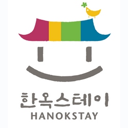
- “Enjoyment” – since that is the meaning of “Laon” I was looking to either use a font or some kind of imagery within the logo that would reflect that. I thought of the smiling mouth in the Amazon.com logo and found a similar one in the Hanok Stay logo. Additionally, I thought an orange/red color would be good to reflect both passion and happiness
Round 1: Idea Formation
With the first images I sent, I tried to incorporate many of the above items: a smiling face, a script font, the roof in a script style, and so on.
Note: Of these initial fonts, I eventually chose the font in the upper-right corner because:
- The lower-right character ‘ㄴ’ looked slightly like a smiling mouth
- The upper circle ‘ㅇ’ reminded me of an eye
- With the vowel sound ‘ㅗ’ in there, I was able to create something like a nose
I eventually customized the letter forms in this font quite a bit to make it absolutely unique and avoid using the font itself as it required a commercial license to be used for a business (free for personal use).
Round 2: Focusing In
After Round 1, the reply was that she preferred the following logo style:
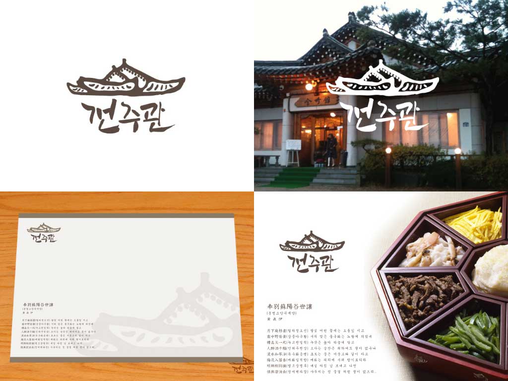
These other two images were also pointed out as excellent examples I should consider. Eventually, I traced the second logo to show it was easily possible, but I wanted to avoid copying anything entirely (inspiration is fine, copying is not).
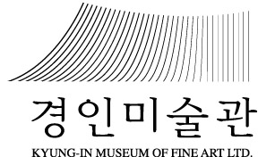
So with the second set of images I tried to focus more on the lines of the Giwa tiles as the Kyung-in Museum of Fine Art’s logo did.
One of the biggest problems that I noticed with the combination of the roof shape and the word ‘라온’ was:
- The roof was very long and horizontal,
- But the word ‘라온’ was almost a square shape
It’s very difficult to pair such a short word with a long, horizontal shape. The logo examples below work well because the words are long enough to fit nicely under the roof and make the designs visually interesting.
In some cases, some of the letters could even be used (in other logos) as pillars of the house that support the roof. But with only the two-characters of ‘라온’, this match was difficult.
Here’s a message I sent explaining this:
The problem I’m having with 라온 is that the word is not wide left to right, but the roof is wide left to right. 라온 as a word is shaped like a square.
Round 3: “Outside the Box”
After much back and forth over the phone and through KakaoTalk (and multiple Google searches later), I stumbled upon a very iconic and classy logo that instantly stood out to me and I had a hunch it would be a winner.
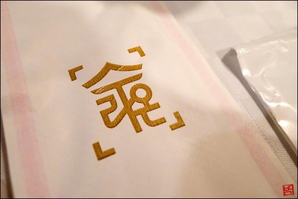
It was for a restaurant in Seoul next to the Express Bus Terminal called “Su Laon” and part of the reason I thought it would be perfect was because it went completely “outside the box” as far as the previous design conversations had been going. And it was simple, iconic, and an instant classic.
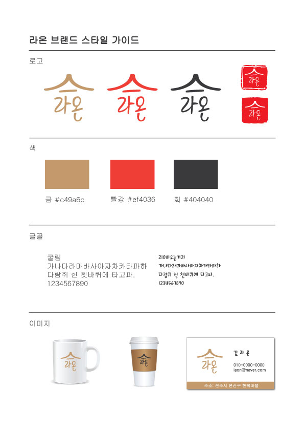
I quickly put together some designs with a hanok roof, the word ‘라온’ and a script font. I even created a simple Brand Guide with images of the Cafe + Guest House itself using that logo in various forms.
This is the message I submitted these designs with:
For a logo simpler is better – it prints better at small and large sizes and is more memorable.
I think the “point” of the roof is the peak just over the entrance gate. It is here at the top of the image.
The line under the roof shape symbolizes the gate, and the first letters (above ㄴ) show the first floor of the building. The ㄴ is the second floor of the building.
Also, the ㄴ is a kind of smiling face. If you turn your head a little, the 오 becomes an eye and the ㄴ is smiling at you.
I feel like this is a good logo because it’s very easy to remember – customers can even draw it to show their friends. It also has symbolic meaning with the roof shape, the building shape, and a smiling face all in there.
Originally, the WHOLE roof of their building is TOO complex for a good, simple, memorable, iconic logo symbol. But using this “point” of the building matches well and creates an iconic image.
My contact agreed except for one minor thing: It says ‘Seh Laon’ now.
Oops. Back to the drawing board. He said the roof shape didn’t look enough like a roof and too much like the Korean letter ‘S.’
Round 4: Back to the Drawing Board
So, I began experimenting with the roof design again. I even tried some different fonts – non-script fonts to see what would work and what wouldn’t.
Design can be just as much a process of discovery as a process of creation sometimes.
Sometimes you just have to try a whole bunch of things, and totally different things, in order to find out the right direction to pursue. Often there are loads of failures first before there’s success. I try to get through all the bad ideas as quickly and early as possible (with a questionnaire, sketches, lots of communication, and quick designs on the computer) in order to get to the GOLD toward the end of the process.
Back to the drawing board.
Toward the end there, I even started trying to go 3D, to make something that reflected the lines of the Giwa tiles, the shape of the house (and 2-floor structure), and stand out as unique and totally original (have you ever seen another 3D Hanok logo?).
Round 5: Back to Research
I sent the following message a day or two later after I’d totally wracked my brain with design ideas and exhausted myself:
If the “point” of the logo is 기와, maybe I should not make the shape of the ROOF at all, but the shape of the 기와. Also, round shapes are friendly, and pointed shapes are aggressive. I have a few ideas, maybe something much simpler, not brush style, similar to the Starbucks logo. I’ll send some more ideas later.
I watched two Logo design courses on Lynda.com to help me brainstorm, simplify my ideas, and get back to the drawing board (again).
But, eventually I stumbled upon this article (Korean) that talks about the design symbolism behind the following logo.
This logo also shows a Hanok roof shape, but it is written as the Chinese character for ‘people’ (人) and symbolizes the sharing of culture with one another.
Then I shared the following message:
Here’s very interesting logo design I found including explanation. It’s very effective – and the logo has lots of meaning.
This shows a little how hidden messages and meanings can be shown in a good logo – including how logos can convey and express emotion. So, it is more useful to know the kind of emotion and meaning we want to create FIRST – instead of just focusing on the image alone.
One thing to keep in mind is that if the logo looks very similar to too many other logos like it (if it looks like ALL the logos in Hanok Village, or if it looks like ALL coffee shop logos) then it won’t stand out and be unique. It’ll just be the same and get lost in the noise of so many logos and advertising.
I also sent the following image (I found only that day) as another example of something similar she might be interested in.
Round 6: Success! (And Modification)
Good news for you~~
I sent all you did to her. So she decided to focus on only coffee shop and chose 스 라온 style.
We put the meaning “스” as “human” so it’s 사람이 즐거운 카페 (“the cafe that people enjoy”).
For final checking, could you change the font with recent one?
Great! She chose the one I expected (in Round 3)! Though I didn’t really expect that font choice after all the concern about the handwritten font. Anyway, I sent another update.
I also added in a lighter orange on this one and created a gradient on the logo as well as the card design samples similar to the blue logo I sent in Round 5.
But, turns out she preferred the script font after all.
I double checked the font license to finalize the design and found that it would only be free for personal use, but we’d need to buy a commercial license to use it for her business.
A note about font licensing:
From what I’ve read, these are the basics when it comes to font licensing (but I’m no lawyer, so be sure to investigate each individual case):
- The letterforms themselves are not copyrighted, so usually the use of a font within a logo is no problem
- What IS copyrighted is the font itself (the piece of computer software that sits on your computer and allows you to type documents in it)
- Sharing a font (the software) is the same as copying a CD or DVD – you personally should own a licensed copy yourself
I got a quote for the font license at:
- 396,000 won (around $400) for up to 10 computers
- 744,000 won (around $750) for up to 30 computers
These licenses are obviously meant for agencies and print shops who would use the fonts extensively. For our needs, however, we decided to not use that particular font for the logo. This meant that I would customize the letterforms so that they didn’t match the font itself, but would be absolutely unique.
Round 7: The Final Round
You can see comparing the Final design to the Original design that I customized the font to be a little more cursive, the characters a little wider, and the faux face a little more pronounced in the second symbol.
In Use
The following images were my drawings sent to the client about how she might use the logo for her business.
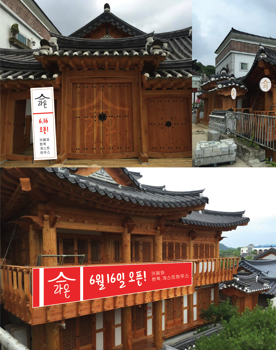
And these images are the ACTUAL logo design used on the building’s sign. I found these on the photographer’s website who shot the property for advertising purposes, and the sign (minus the logo) was created by the print company.
Find the rest of the photos of the property at their website:
