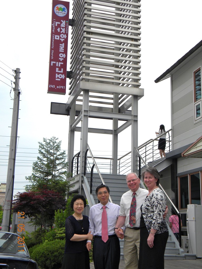
Before beginning my Master’s program in Media Design from Full Sail University, my (just married) wife’s former pastor/mentor decided he was ready to move back to the city to start his own church. She suggested that I create a logo for the church as they started getting set up.
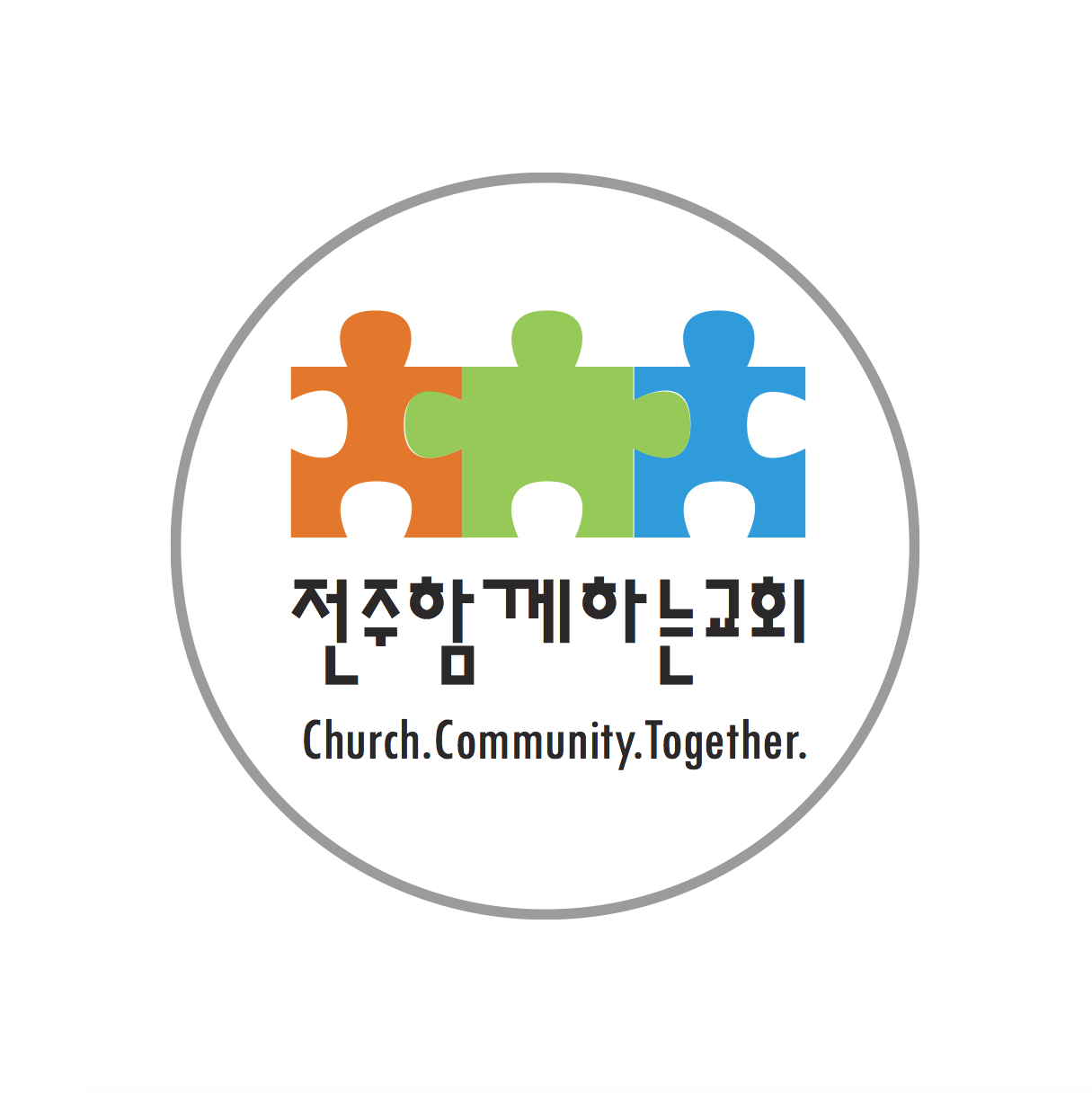
The church name is “함께하는 교회” or “Together Community Church” in English, so an emphasis was needed on the “togetherness” aspect of the church. The reason for the tagline reading “Church. Community. Together.” is three-fold:
- I didn’t originally like “Together Community Church” as it didn’t sound exactly right to me in English (maybe “Togetherness” would be better?)
- I wanted to emphasize the THREE distinct yet connected pieces to this “puzzle”: it’s (1) a church, (2) a community, and (3) tightly knit together
- I wanted it to act more as a tagline than the literal church name
In later designs, we changed the tagline to the “official” church name “Together Community Church.”
After playing around with a few different options, I settled on a combination of puzzle pieces that slightly resemble people (church members) holding hands. This, combined with a unique font I found that matched some pre-existing text in their new building, and the logo was a big hit. The pastor’s daughter asked me at the time, “How do you come up with such great ideas?”
Later, “Jeonju” (전주) was added to the logo to differentiate it from another similar church in the city:


