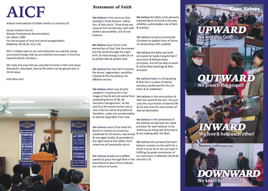
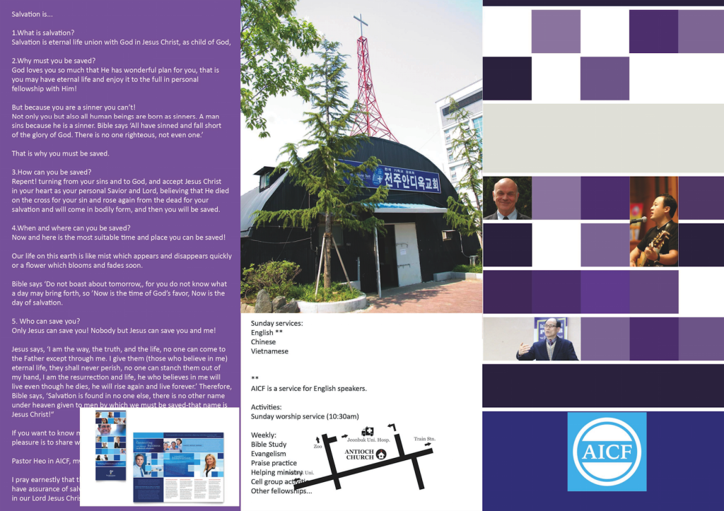
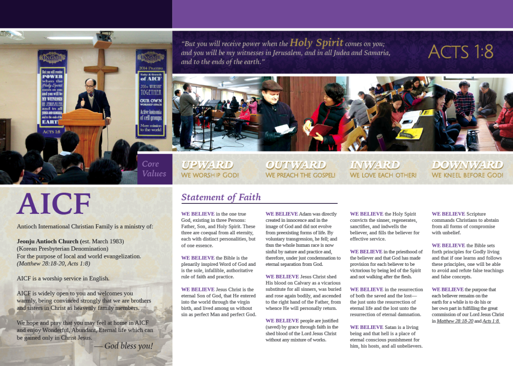
In early 2014, the AICF church pastors asked me to update our church information pamphlet as a tri-fold brochure that could be printed on an A4 paper. After visiting the print shop and confirming the measurements, I set to work. Since we were right in the middle of the Matthew series at that time, I used the same design elements and colors from the Matthew sermon art to influence the design of this brochure.
Brainstorming
During the brainstorming phase, I started out by simply adding all the text the pastor sent me into a Photoshop document and resizing it and positioning it in a tri-fold design with a few images.
Eventually, I began Google searching brochure images until I found some that inspired me:
After finding the above image, I set to work redesigning the church brochure so that:
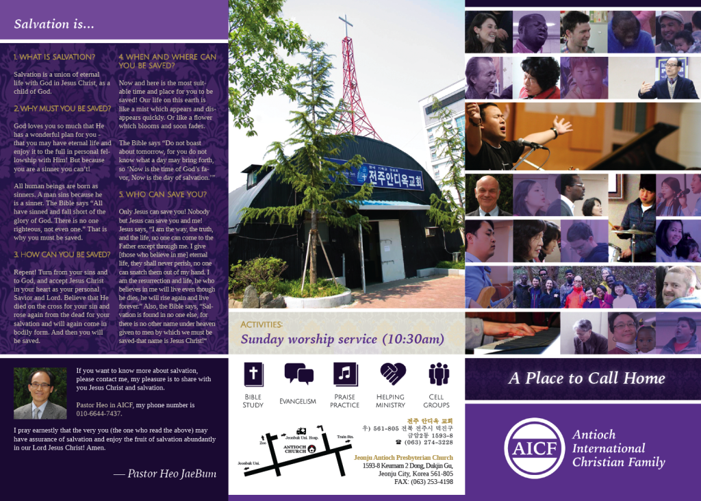
- It emphasized “community” and “family” (the church motto) more clearly with the images on the cover
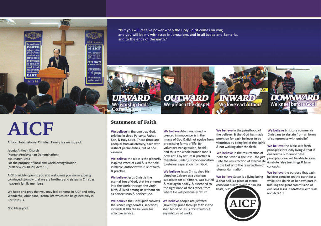
- It broke away from a strict tri-fold three-way split over the pages, allowing some content to overlap between pages
- Kept the same original 4 images for the church’s “Core Values”
Version 1
Final Version
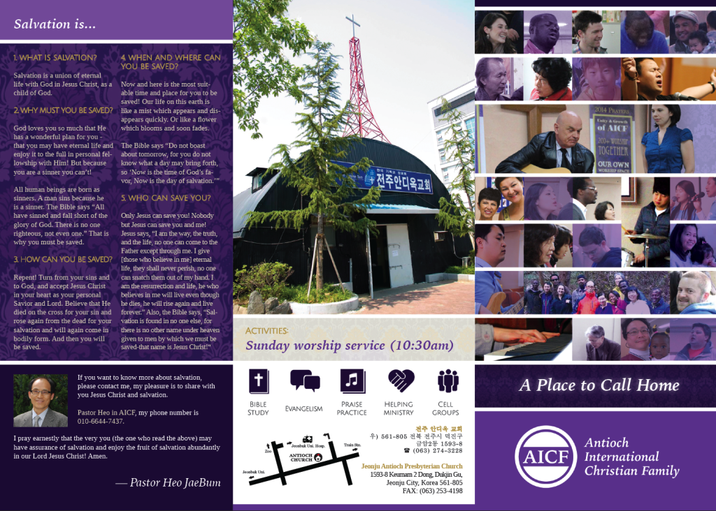
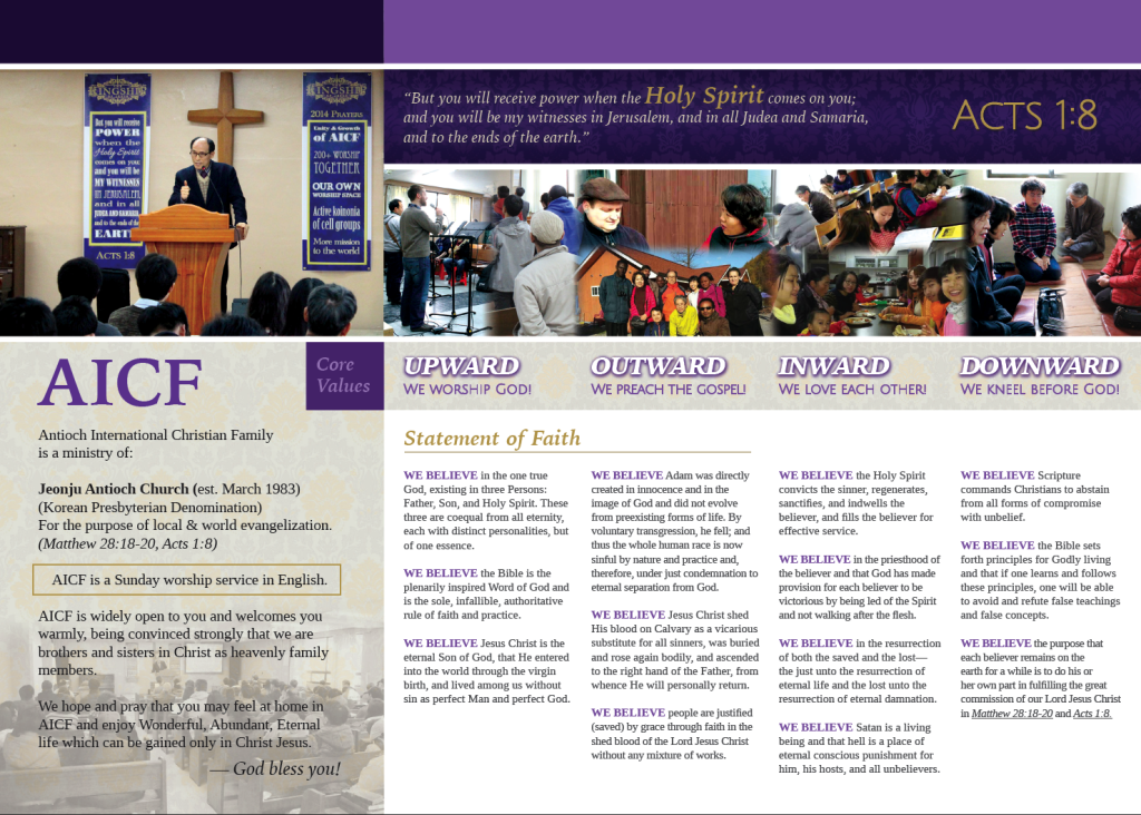 Changes between Version 1 and the Final Version include:
- More prominently featuring the second pastor on the cover
- Darkening the “Core Values”
- Modifying the introductory text area on the inside cover
All in all, this was one of the most satisfying designs I’ve ever put together.

