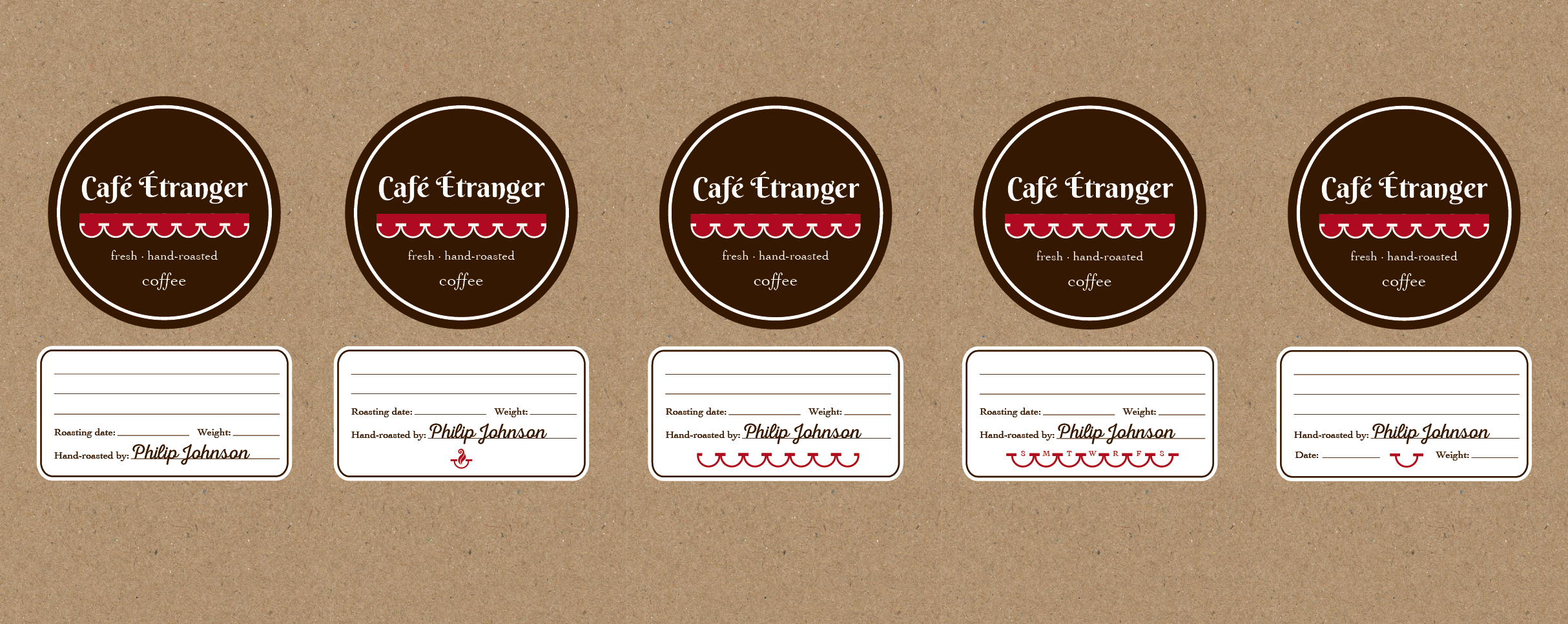
After creating the logo design for Café Étranger, I also took the liberty of throwing together a couple of labels that could be used to write on (using the Nexa Rust Script font the client enjoyed originally as his “signature”). I designed them to be printed by a professional printer, but could also resize them to print at home if with some labels.
I also added a kind of bag-like texture to the background so he could get a feel for what it would look like in a completed format.
Feedback
These look awesome! I was just thinking earlier about how to match the handwritten part with the professional looking label, and this nails it.
I’m undecided on which one I like best. I think the aroma swirl idea is the best here – I quite like how it occupies the empty space at the bottom without filling it up.
Final Designs
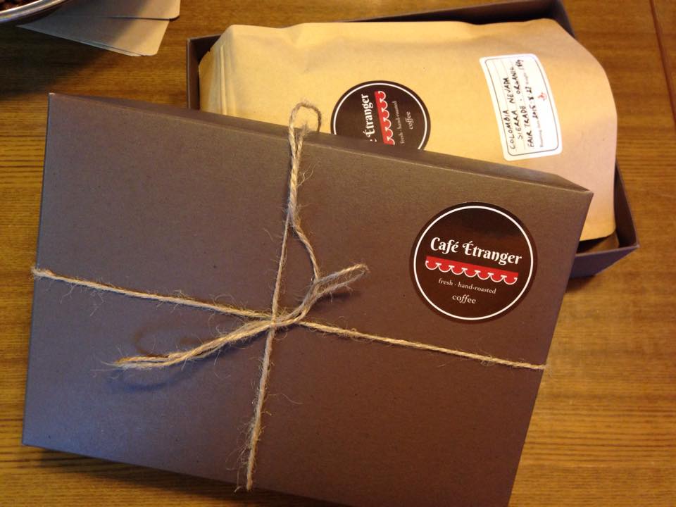
The following gallery shows the final version of the label designs as well as these labels applied to the client’s packaging. See more pictures like this on his Facebook Page.


