In late June 2015, one of my friends approached me to create a logo for his coffee roasting side business he was starting. He called it Café Étrangér (“foreign coffee”) and he wanted to target primarily the expat community in Korea with his beans. Below, you can find the full Project Brief notes I used to help create this logo:
Project Brief
Who are you? Describe your company & what you do (mission statement / purpose / values):
Café Étranger is a boutique coffee roasting label that provides quality roasted coffee beans directly to customers – mainly those who make coffee at home (selling more or less on a roast-to- order basis, at least for now). I want to not only emphasize the freshness of my product, but also the choice of fair trade approved coffee beans. In a way I want to market my coffee as an affordable “luxury.” Once people know that fresh is best, I think they’ll be willing to switch from store-bought brands. Also, I hope to eventually specialize in fair trade beans. The market I wish to focus on is English-speaking expats in Korea, many of whom make coffee at home. Being a native English speaker, I feel I can offer lowered barriers to buying quality coffee to this market. The name “Café Étranger” is French for “foreign coffee.”
Who is your target audience?
- Primary audience: English-speaking expats living in Korea.
- Secondary audience: Korean individual customers and businesses.
What is your USP (Unique Selling Proposition)?
Freshly roasted coffee, which means the best possible taste and aroma. Coffee is at its best for about two weeks from the time of roasting, a timeframe that is impossible for most ‘supermarket’ brands to achieve – especially if roasted abroad.
- Your competition: Costco, Starbucks, other local boutique roasters
- Brand adjectives: Quality, fresh, European, Parisian, relaxing
- Brand colors: Red, green, black, brown
- Preferred Logo type: Word, image, abstract shape
- Logo qualities: More feminine, mature, luxury, classic, serious, quiet, simple, subtle
Initial Concepts (Client)
The following are the initial design concepts the client created in Microsoft Publisher to give me a feel for the kind of thing he was looking for. His notes for the concepts are included as well.
Notes:
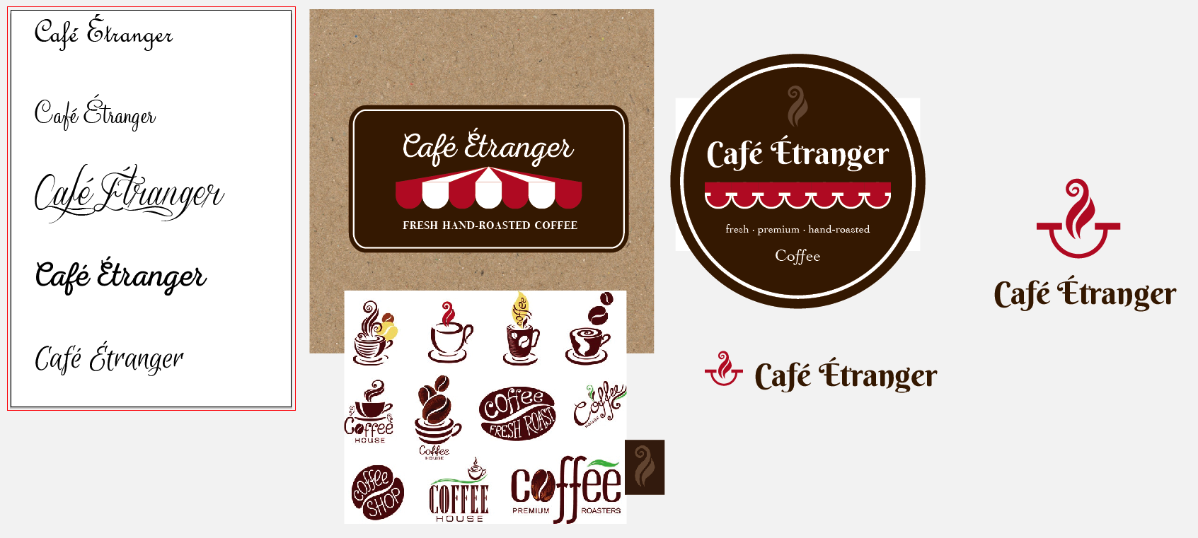
My thoughts in making these drafts were to evoke the image of a Parisian café, hence the script-type font and the logo picture that is supposed to be the fringe of a red and white awning that covers tables on the pavement.
I’m not totally set on the idea of a script-type font. (In fact, it seems many cafes in Paris use simple fonts in caps), but I did see one I quite liked here (pictured above). It’s the one on the sign above the awning.
I’m also open to a different logo pic from the red and white awning representation, but I do like that (to me at least) it seems pretty simple and effective, and shouldn’t be too expensive when it comes to printing cards and labels. I tried adding blue to make it more French, but I think that detracts from the original indication of café.
Initial Concepts (Designer)
The following are my initial concepts based on the Project Brief and the designs sent to me by the Client. My notes on the designs follow as well.
Notes:
Here’s a first sample. There are two primary varieties – let me know if I’m on the right track or if I should do something differently.
Sample ONE:
- I used a font called “Nexa Rust Script” because it looked closely like the one you sent me, but slightly cleaner.
- I added “Hand-” to the front of “Roasted” because I thought you might want to make that distinction as a kind of selling point. The font used there is “Bodoni 72 Old Style” to kind of mirror the old style fonts you like on Parisian coffee shops.
- I recreated the awning you sent originally and made it look 3D-ish by pulling it toward the back.
- I created a rounded rectangle “sticker” around it and set the background to the kind of deep brown I mentioned earlier.
All in all, sample one follows your original design ideas the most closely and I’m happy to adjust it if you want.
Sample TWO:
With this one, I just had fun and played around with a bit. There are some very unique logo features in here that can further emphasize your brand characteristics especially if you point them out to people.
- I changed the fonts up quite a bit. The brand font is now “Berkshire Swash” and I chose it because it reminded me a lot of some good coffee brand labels I’ve seen in the marts before – so it immediately carried with it a sense of brand power/authority (in my opinion) – plus it’s clean and looks nice.
- I kept the red awning, but changed the color to ALL red and gave it the same white line design that the cafe you liked (“Le Cafe Pierre”) uses in their awning. This design is now more significant for two reasons:
- There are seven equally sized and colored loops in the awning – they represent each day of the week, Monday – Sunday
- The white lines form a kind of “smiley face” that indicates happiness and pleasure when drinking this coffee
- I also added a swirl of “aroma” at the top and used the “smiley face” from the awning under the “aroma” to create an iconic logo you can use on business cards, etc
- For the tagline font, I used “Cochin” and made it all lowercase to de-emphasize it and make the brand name stand out more
- I added “premium” to the tagline and separated the adjectives with dots to make them look more like keywords/brand words than a tagline
- I added “Coffee” at the bottom with stylized f’s
- The sticker itself here is circular
Other stuff:
The other stuff on the page shows a few more fonts I played around with as well as some other coffee logo designs I looked at.
Please let me know what you think. Happy to adjust what you like/don’t like. I’m personally partial to logo idea #2, but this is your baby, so I want you to get what YOU really want.
Additionally, ANY of the design elements on the page can be used/re-used in multiple ways.
Design Feedback
Thanks for the good work! I really like the #2 design. I have to agree with you on the font selection, it is clean and gives a bit of authority. Plus (sadly for me lol) it is much more legible than the Nexa script font which is important, even though I have quite a thing for the script font. Perhaps I could write my name in the Nexa script on a business card. Also, the new awning looks great. My wife remarked that in design #2 the title/logo combo look very complementary. The dots between adjectives are also a nice touch, and I think a circle design is more appealing than a rectangle.
A couple of tweaks that I thought about:
- I like the ‘hand-roasted’ addition but I think ‘premium’ might be one adjective too many so I’d like to try omitting it
- I wondered about changing the upper case C in Coffee to a lower case c. Don’t know if you tried that already – what do you think?
- I’m in two minds about the aroma swirl. It’s a nice little touch but I think again I’m more in favour of simplicity so I’d like to omit this too. Maybe the other elements could be raised a bit if it leaves too much empty space at the top? I wondered briefly if the awning would look OK above the title rather than below, but that was just a passing thought.
Round 2
Notes:
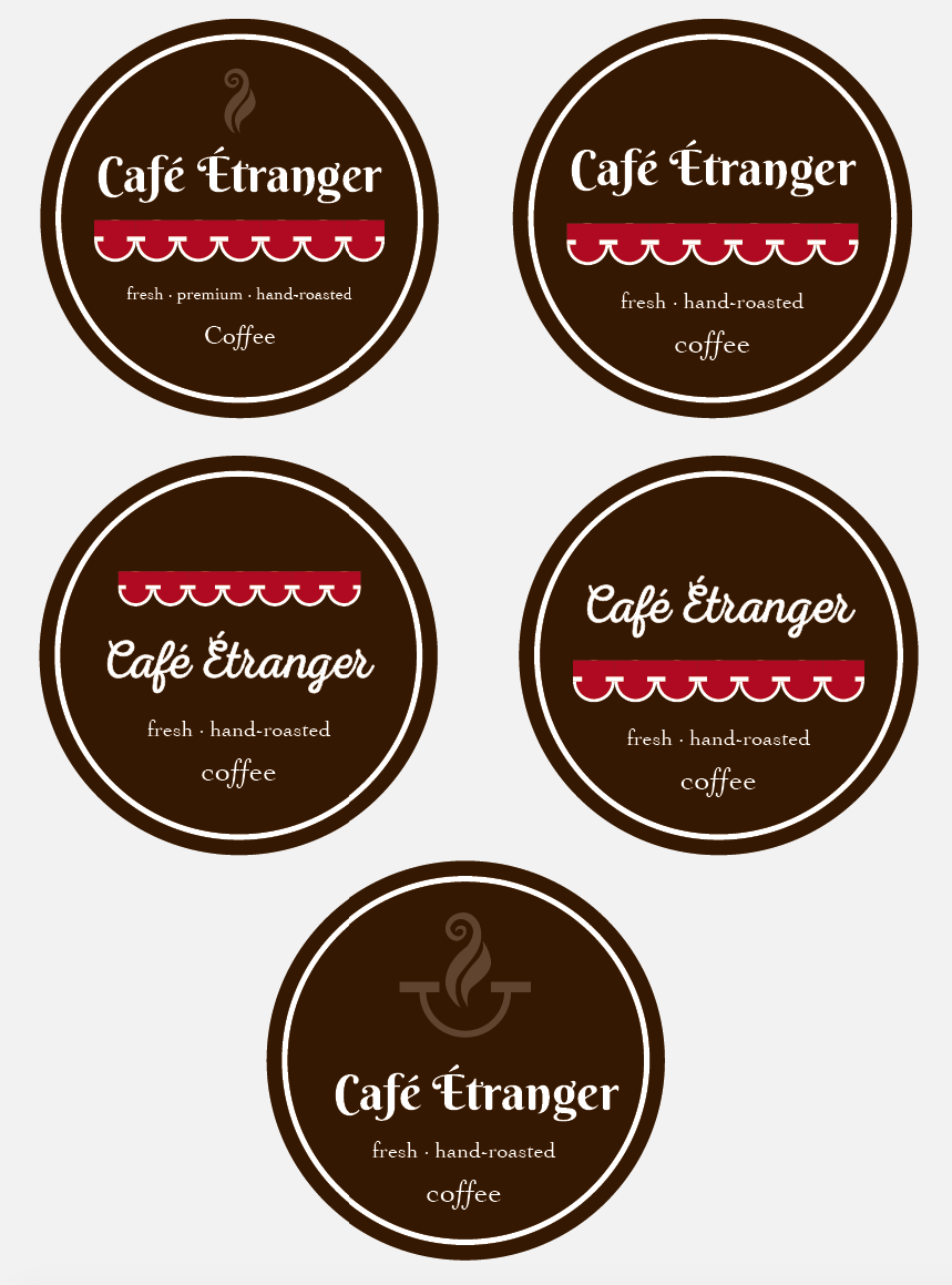
Here’s a second sample with changes as you suggested. I also added in the Nexa Rust Script as you seemed partial to it. Let me know which one is best and/or if there are other modifications you want to try.
Feedback
Thanks, they look really good! I’m happy to go ahead with the second one (top right-hand). One small alteration that I’d like is a slightly closer distance between the title and the logo. I guess with the extra space available everything is spaced out a bit more, but I’d prefer the bottom of the lettering and the top of the awning pic to be as close as they were in the original design.
Final Design
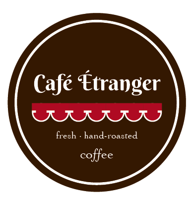
Aaron: Is this what you’re looking for?
Client: Perfect! Thanks 🙂
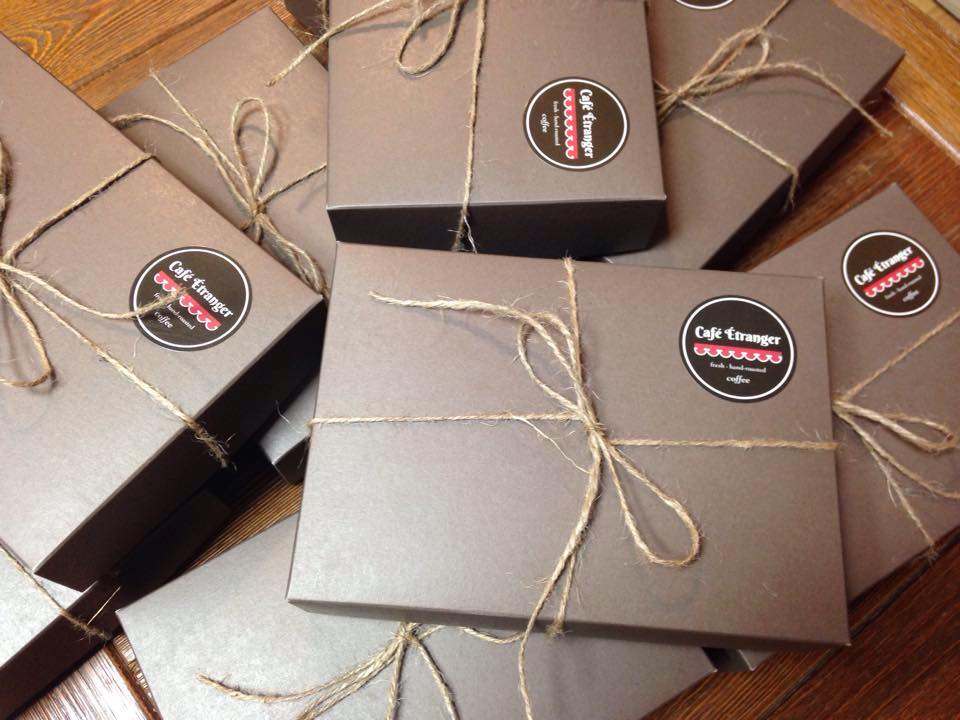
Here’s a sample of the client’s packaging with the logo stickers applied:
See more photos like this at his Facebook Page or on the Café Étranger Labels project page.


