I enjoy making these posters (mostly because I enjoy looking at them when they’re posted – and I personally think my designs look better than the other KOTESOL poster designs).
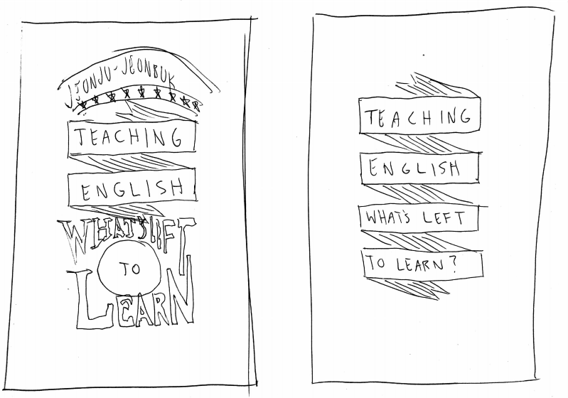
However, when I was given the Conference title this time – “Teaching English: What’s Left to Learn?” – I was a little stumped. I wasn’t sure whether or not to take this question rhetorically or literally and there isn’t honestly much “visual” going on within the question itself to give me an idea of how to best design the poster.
Previously, I was given some pretty solid “visual” concepts to work with including chameleons and Sherlock Holmes. I even designed the 20th anniversary poster with a unique font logo and traditional Korean wall. However, with this design, all I could think about (at first) was the inside of a classroom – and that to me is usually boring to look at.
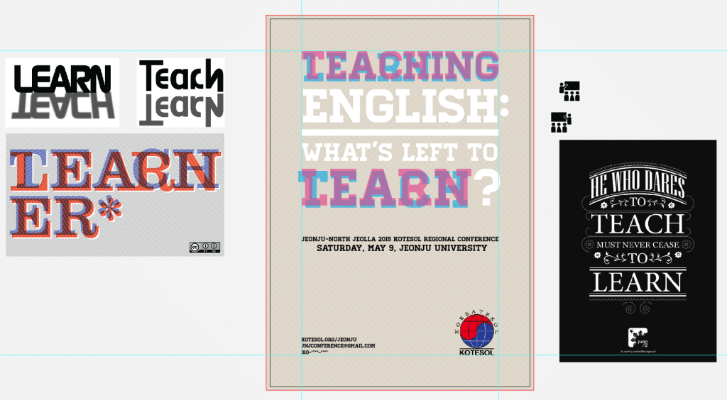
After brainstorming a bit, I decided one of the best things I could do would be to show the correlation between Learning and Teaching (and how one leads to the other and both draw from each other) by overlaying the two words on top of each other. My first concept was to create a kind of anaglyphic 3D effect with the two words:
However, that concept made some of the text relatively unreadable, so I went back to the drawing board for concept 2.
In concept 2, I decided to just do a quick Creative Commons image search on Flickr for classrooms and I found a great image by Pierro Sierra called “Einstein’s Classroom” that he says, “is [technically] next to the Princeton physics hall Einstein used to attend.” I doctored the image up a bit:
- Desaturated it
- Added an overlay color
- Added a Gaussian blur
And then added some banner-like text that I was inspired to create by browsing various other “typography posters” on Google images. I also kept the Teach/Learn overlap, but greatly reduced the opacity of the “hidden” text.

Concept 2’s background was a little dark and the overlay color behind the banner-text was 10% white, so I changed it up for the final design: lightening the background image and making the overlay behind the text 15% black. You can see the original “Einstein’s classroom” image and the second and final concepts below:


