REACH reached out to me to design some contact cards for their small organization and told me “you might need to ‘tweak’ the logo a bit.” So, although the design request was primarily for a set of contact cards, I put in a pretty significant amount of work on the logo as well for the simple fact that a calling card without a standout logo won’t itself stand out.
Original Logos
There were two logos that had been in use previously, both designed by members or friends of members of the group:
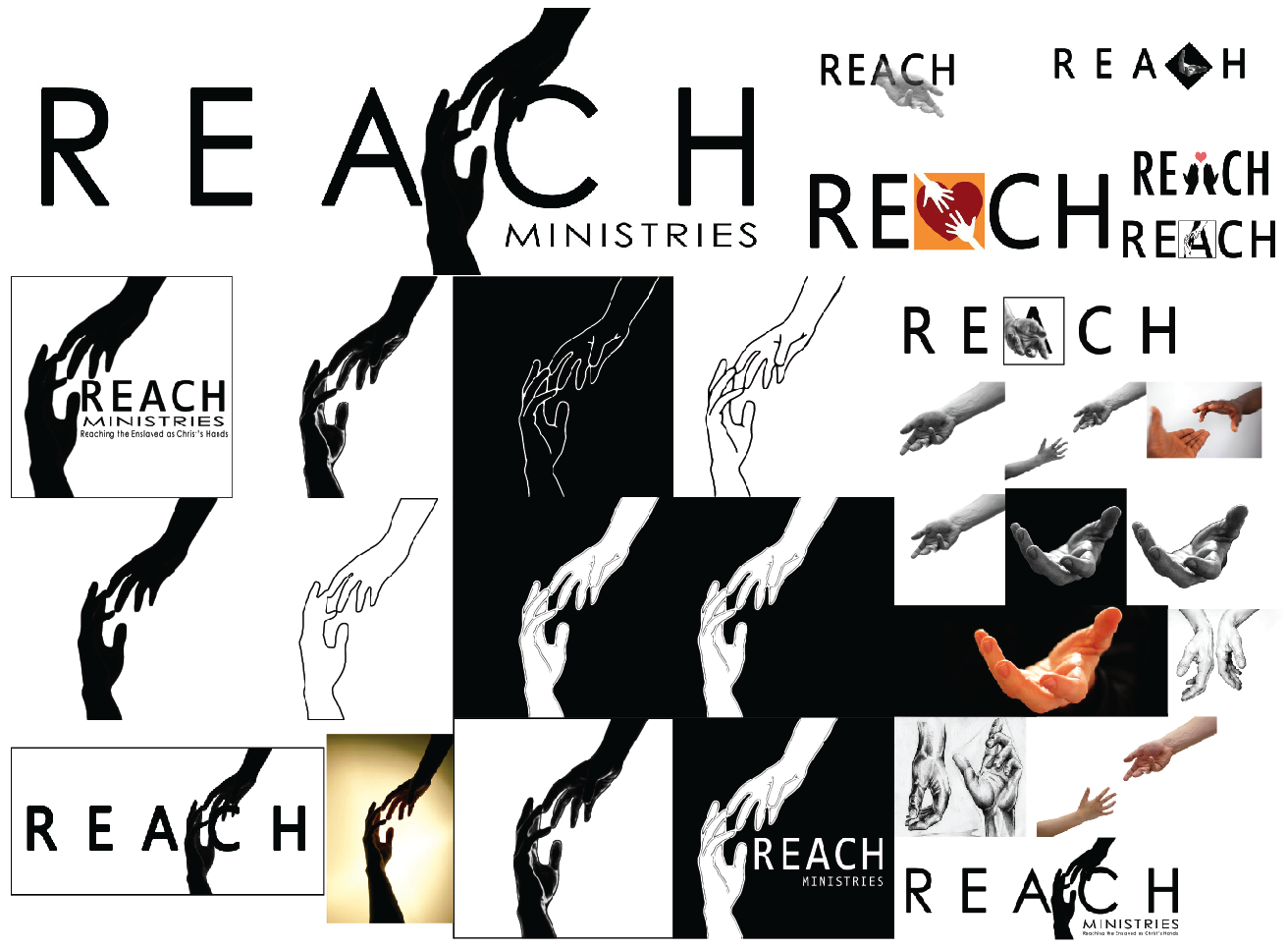
And after receiving the go ahead to tweak these logos a little, they sent over their entire stash of logo ideas and options:
Obviously “hands” were a key design element and they seemed quite fond of the paired hands in their second logo, so I decided to work with that. I asked about symbolism in the logo or color associations and was given the following guidelines:
- REACH stands for “Reaching the Enslaved as Christ’s Hands”
- The organization ministers to primarily prostitutes in Jeonju’s red light district
- The target audience for the card however is NOT the prostitutes, but rather other people who might be willing to support the ministry
- Black and white are the primary colors, red a highlight color
So, the keywords: reaching out, enslaved, Christ’s hands, blood red, darkness vs. light, and despair vs. hope influenced my design choices for this logo.
Logo Designs
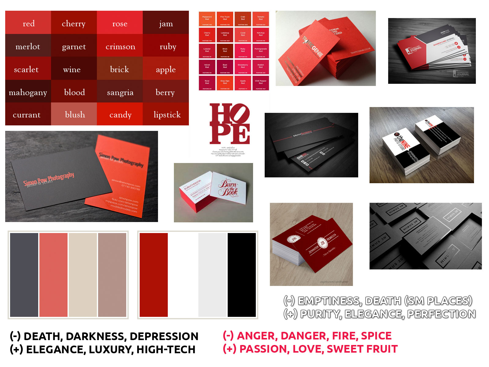
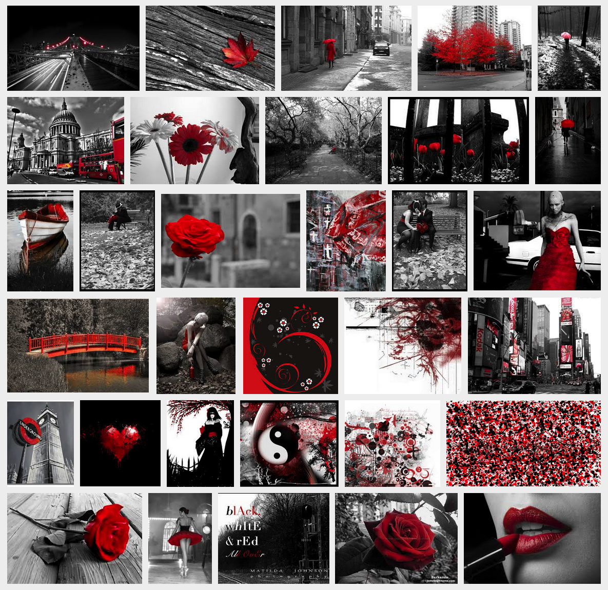
I began with a moodboard to show various black, white, and red business cards as well as to introduce a small amount of color psychology to the team (as their brand colors seemed to have initially been chosen by chance).
All colors can convey both positive and negative connotations (as shown in the moodboard above). I really wanted to get at the heart of what this logo, brand, and organization was trying to convey to its audience.
Black and white
Black and white, for example, can play off each other for a deep contrast of despair vs. hope, light vs. darkness, and so that interplay between the colors had a deeper spiritual connotation to me (one that I anticipated they’d want to capture).
I felt that a pure white background with black hands was a little too “bright” – but with “sinful” (black) hands, but a solid black background with white hands was a little too “dark” and without hope.
Red
Adding in red could easily be anticipated to mean “the blood of Jesus” that saves, covers sin, and so on, but I didn’t want to just go with the “default” right away. I initially suggested “ruby red” (as in grapefruit red) because I was inspired by a similar Christian ministry design that used black, white, and pink to convey a very similar message (“hope in despair”):
But the group preferred something “bright red” so I went with something brighter.
Fonts
I found the Ubuntu font to be a good fit for the logo for two reasons:
- The shape of the capital “A” resembled the original logo’s “A”
- “Ubuntu” comes from a South African word meaning “human kindness” which I thought was a great way to represent this group that also was seeking to express “human kindness” to the prostitutes in Jeonju (plus, there were a few South Africans on the team, so I thought it would be a good fit)
Later, I paired the Ubuntu logo font with Lora for the back of the contact cards.
Designs
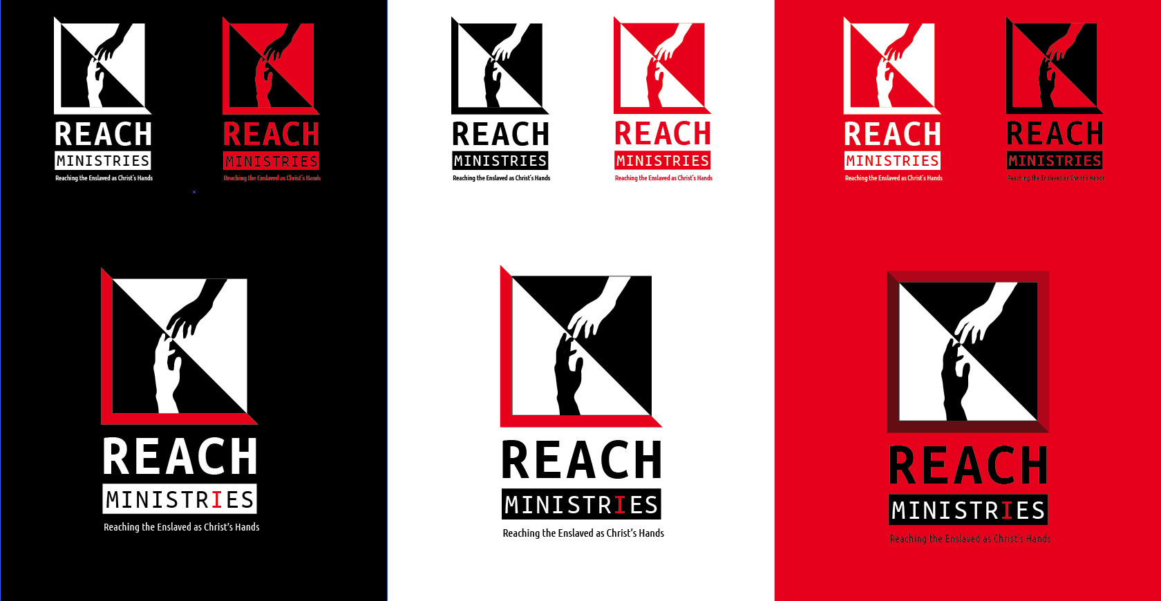
Below is the evolution of the new logo design:
- Only updating the font (Ubuntu Mono font = “Ministries”)
- With a triangle to contrast “light vs. dark” and “hope vs. despair”
- With a red highlight – highlights “I” as in “I can help”
- Multi-colored options
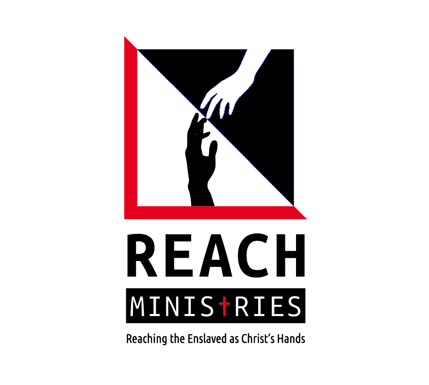
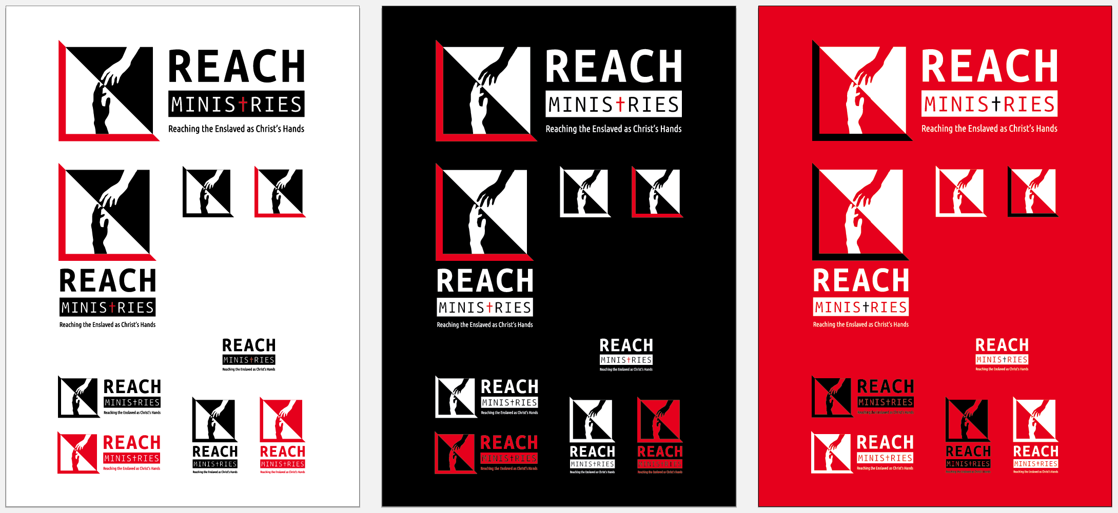
- Final designs (with “T” replaced with the “dagger” symbol and cut off at the bottom to represent Jesus’ cross)
Branding Suggestions (Images)
To go along with the black, white, and red logo, I thought that black and white photography with a red highlight would be a good suggestion for future brand materials. Take a look at the example images from Google Image Search below:
