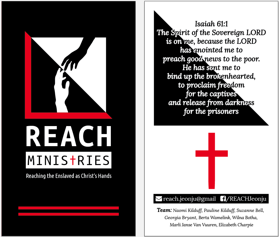
The REACH Jeonju Contact Cards were designed in close correlation with the REACH Logo Redesign.
The REACH team wanted some kind of contact cards for the team to distribute to churches and other people who were interested in helping to serve and minister to the prostitutes in Jeonju (these were not designed to distribute to the prostitutes themselves).
Below, you can see the different stages this design went through until arriving at the finished product:
Design 1
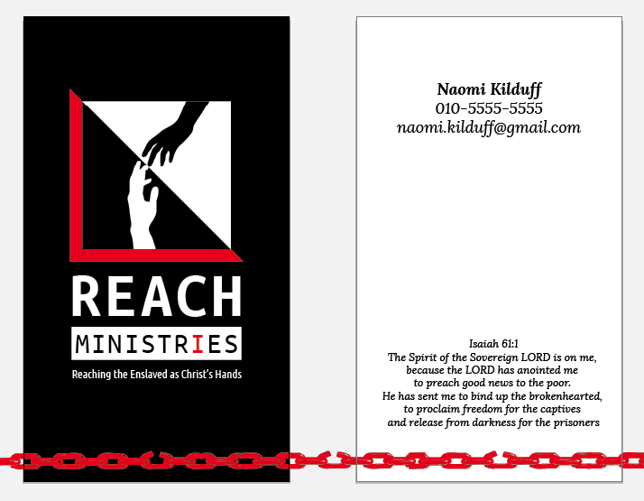
Puts emphasis on the name and contact info on the back, less emphasis on the Vision Verse. The “I” in Ministries is highlighted as in “I can help” and a chain (symbolizing “enslaved”) at the bottom is being broken.
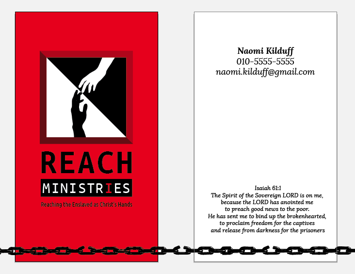
Design 2
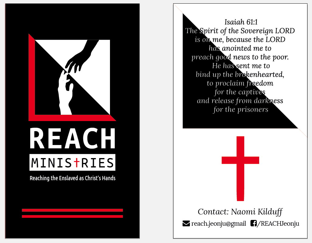
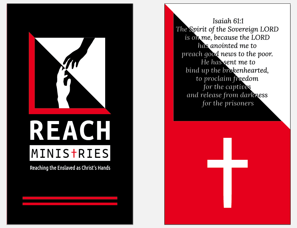
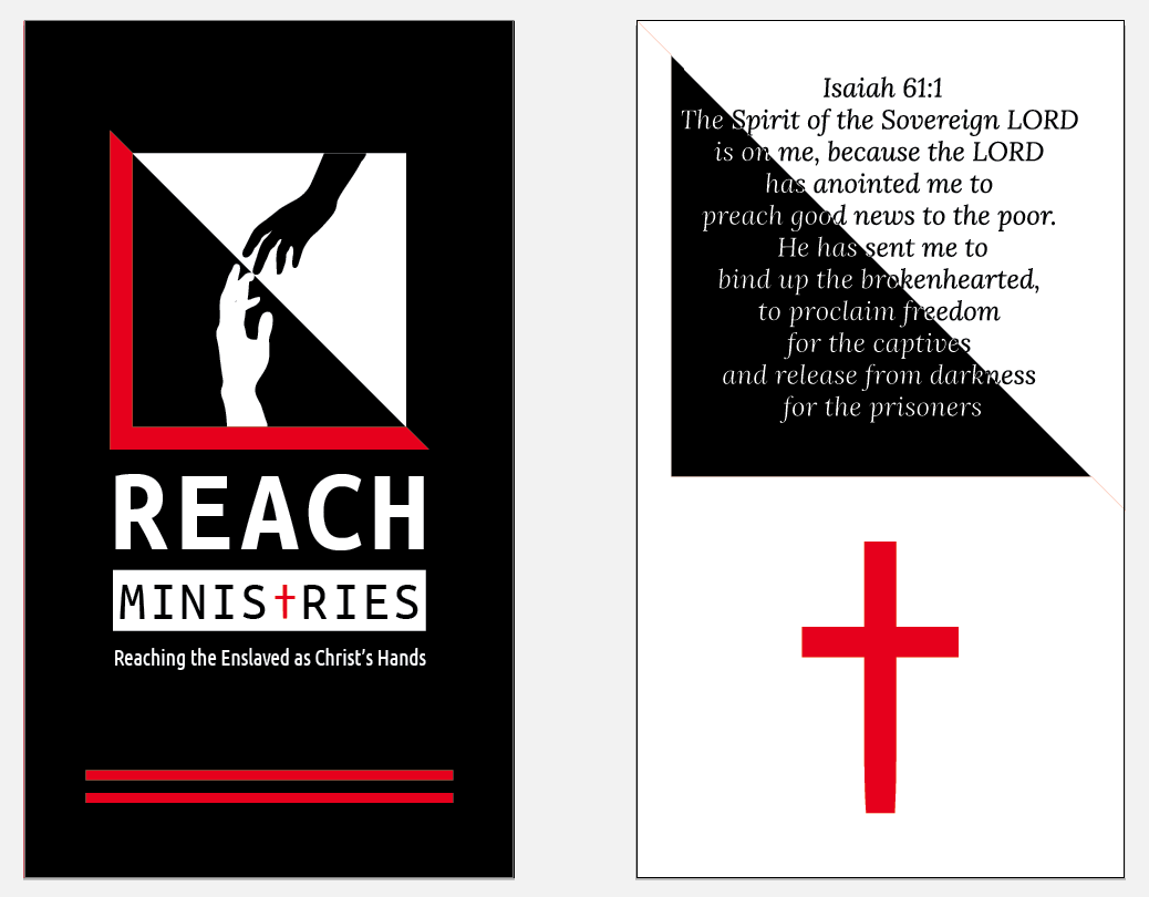
The breaking chain at the bottom wasn’t a hit, so I was thinking about how to incorporate some other symbolism from the logo or elsewhere into the design and came up with this. It uses the same triangle design from the logo and puts an emphasis on the Vision Verse rather than the contact name. The “T” in “Ministries” is emphasized with a “dagger” icon from the font that resembles a cross.
Design 3
Second use of contact info. Ultimately, individual cards were decided AGAINST as a typical card printing would generate 500 cards PER NAME. Therefore, the team decided to create a single design with all their names and the Facebook Page and email.
Design 4
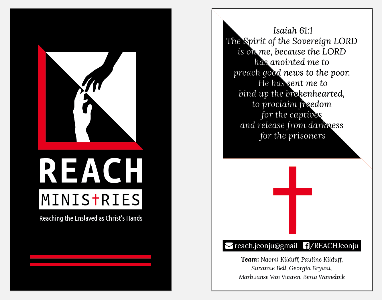
The first look at a design with all the names (here there are only 6 of 8 names). The final design (above) also thickens the Vision Verse text in white to make it more readable against the black background.
