Winning Story is a coffee shop and study cafe in Jeonju that encourages people to create study groups to meet together and “Make your Winning Story.” (It’s a bit like a personal or business development incubator.)
The business was founded by one of my close friends in 2012 and at that time, he had the design company on the 3rd floor of the building (Winning Story was 2nd floor) design his logo because – as is the case with many Korean design/print firms – you get a better deal with a print package.

In other words, you buy a package for printing signs, banners, ads, and business cards – and the design is included with it. Actually, hiring a designer separately – apart from the printing company – is not something that seems to be done very often.
In Korea, it seems that design firms make most of their money from the printing, rather than designing. Therefore, it often appears to be in the best (financial) interests of the design firms to create designs very quickly (sometimes from templates), rather than with longer, more comprehensive, iterative design processes.
In any case, in early 2016, the owner hired me to update their brand, including:
- New logos (one for the cafe, one for their Dutch Coffee)
- A new (unified) flyer design template which they could use to create new flyers
Design Process
One thing I’ve come to realize over the course of my designing is that it’s very difficult to COMPLETELY recreate a logo from scratch. There are many examples of both failed and successful rebrands.
Thus, I knew from the get-go that I’d need the new logo to maintain the feel and imagery of the original while still doing something new and unique. Therefore, I had in mind to do three things:
- Keep the tree with coffee bean leaves – but modernize it a bit
- Focus more on the “Winning” part of Winning Story
- Maintain a similar, smooth, refreshing, relaxed style
Sketches
The following are a few initial sketches I worked up that tried to create a sort of “coffee emblem” as Starbucks and many other coffee shops use in their branding.

Although these are all unique ideas, I ultimately decided that the original Winning Story tree should definitely be maintained as the focal point of the design. I happened to stumble upon the Interaction Design Foundation’s logo around this time, and used it as inspiration for the Winning Story tree design.

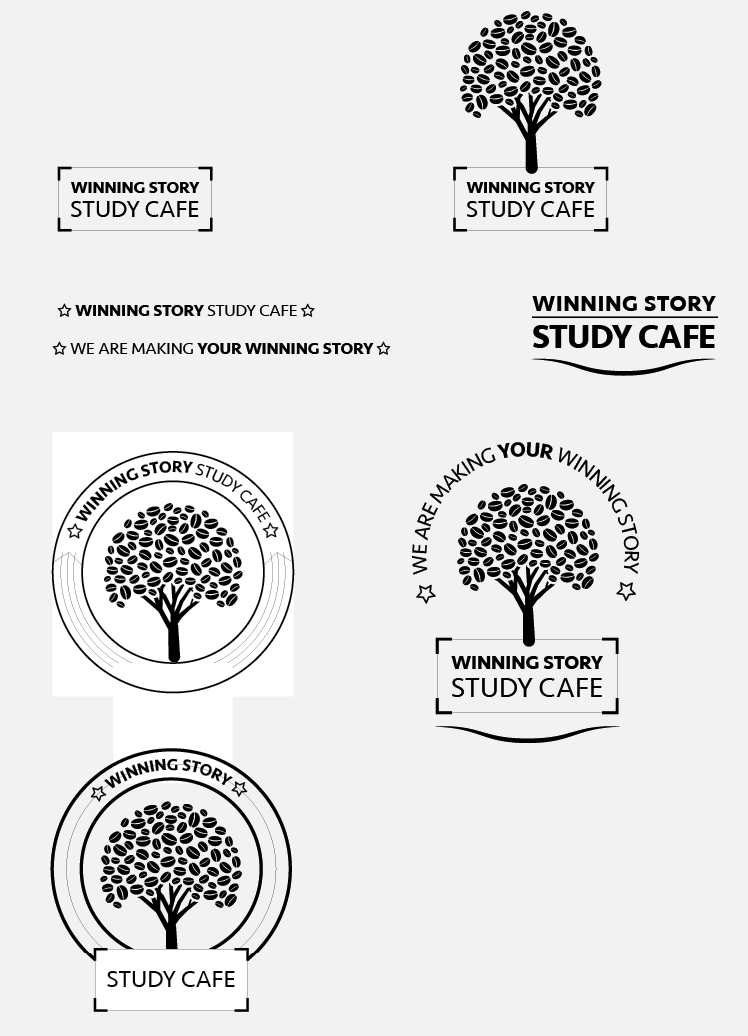
Computer “Sketches”
The following is the initial work I did on the designs in the computer. After doing my research on the client, subject matter, intended audience, and message, then sketching rough ideas on paper, I like to take to the computer to flesh out my ideas and iterate on the designs.
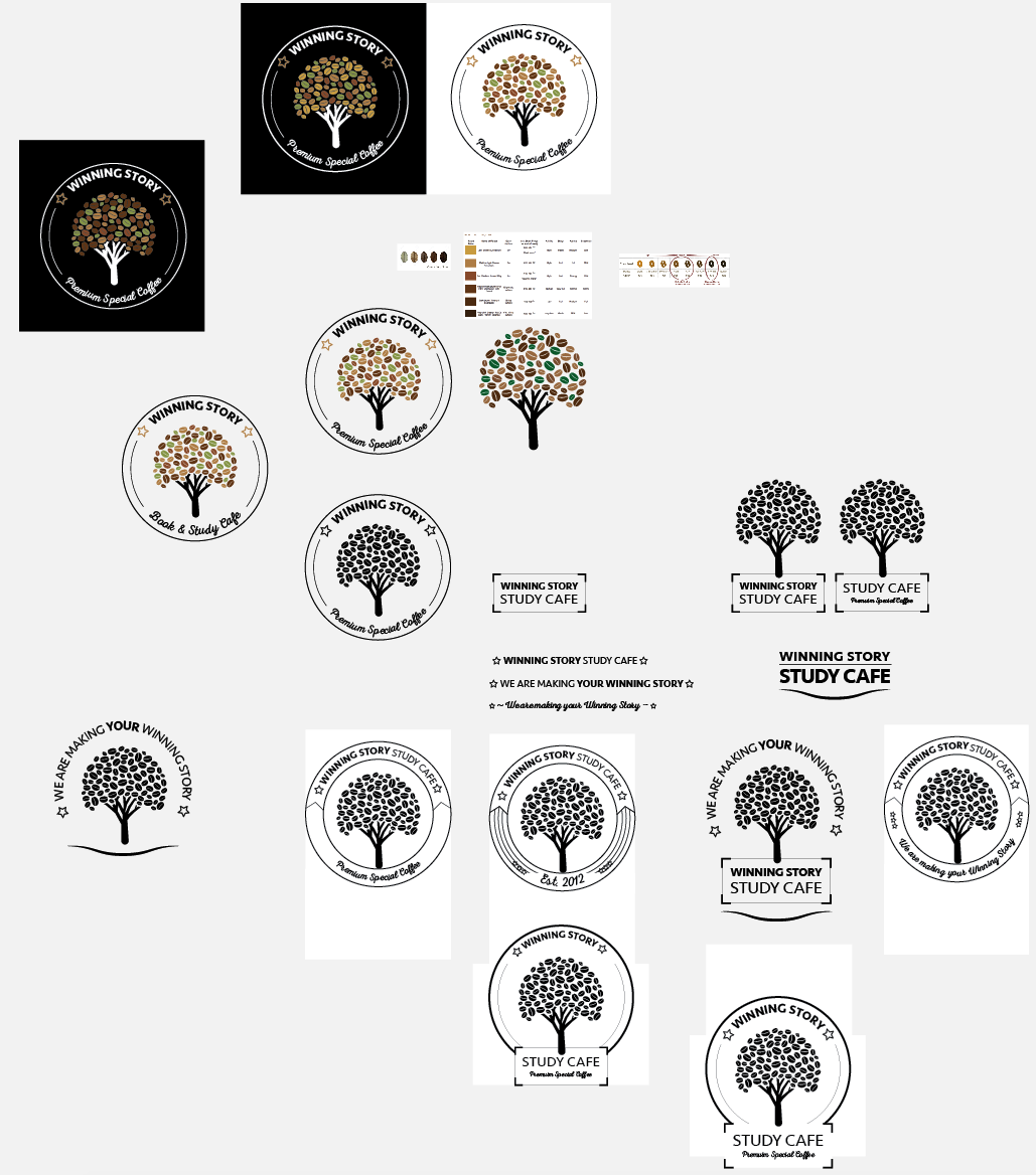
Final Logo
The following image shows the various “final” logo designs for the cafe.


